Things That Make Me Go Mmmruh
February 13, 2013 by A Slice of Orange in category Archives tagged as Annicka Rietveld, cover artwork, cover design, deviantart.com, GVR Corcillo, Iron Man, Lex Valentine, She Likes It Rough, Things That Make Me Go Mmmruh, Tony Stark, Winterheart DesignBut some survival instinct in me bucked at my willingness to sell myself short without even trying. I deep down wanted an illustration that would convey the sexy and off-kilter humor of a story about urban scaredy-cat Lisa Flyte trying to find her backbone by teaming up with aloof adrenaline junkie Jack Hawkins. They go on white-knuckle adventures out in the wild in order to make her brave. But what happens in the wild doesn’t stay in the wild, at least not for Lisa, who starts to fall for Jack. Will what she learns on her escapades give her the courage to go after him? Come to think of it, would I have the guts to pursue what I most desperately wanted? I had to bite the bullet and go for my dream cover. I commissioned a new cover from Lex, and this time I told her my ideas. We both scoured available images for days, but we found nothing that would satisfy me.
Here is what we worked out:
GVR Corcillo
“Jane Austen Meets the New York Giants”
Cover Art Compromise
July 13, 2012 by A Slice of Orange in category Archives tagged as cover art, Lex Valentine, Winterheart DesignI’ve been having issues lately with some of the authors I’m doing covers for. The publisher’s new cover art form doesn’t really tell me what the characters look like. What the publisher is striving for is a new level of communication between the artist and the author. Thus far, I’m not sure if this way of doing things is working or not. I’m at the 50% mark. Half of the covers I’ve worked on have been simple because of this change in the process. The other half have been far more difficult.
Usually, for cover artists that actually do communicate with the author (remember that some houses do not allow this and some houses do not allow the author to have any input on the cover at all either) you can discover pretty quickly who is a diva with an entitled attitude and who isn’t. I’m not sure why, but I am still shocked when a brand new author exhibits this kind of attitude. I was pretty humble when I got my first contract. I was grateful for the things the publisher and cover artist could teach me about the process. I was grateful to have input at all.
When a brand new author comes at me with an aggressive attitude, requesting (okay demanding) to have her vision of the cover and to hell with what’s possible and what’s not possible…well, I tend not to give that person my best work because I’ve shifted into auto-pilot. I put together a cover that gives the author what they want without any creative input from me. The result can be a cover I wish I didn’t have my name on even if the author loves it. I know from experience though that trying to put my artistic stamp on a cover when an author isn’t willing to listen is a waste of time. I always want to tell them, “Look, there’s a reason you’re the author and I’m the artist. Believe me, your vision of this cover isn’t an attractive one!” Of course, I bite my tongue because that’s not professional. And, of course, like anyone who is frustrated I can have those moments where I think that maybe karma will win out and people won’t be attracted to the ugly cover the author likes so much, thereby losing them sales. Yes, I have my mean moments too. Born of frustration usually. Doesn’t mean I act on those moments and it doesn’t mean I continue to feel that way past the silent mental expression of it inside my own head. Luckily, this isn’t the norm.
This week I had a brand new author who had the best attitude ever. The cover I made was for her very first book. She had filled out one of the old cover art forms (not one of the new ones that make me have to grill the author about their characters before I can even start) and described a place in the book and the couple. She did a nice job with her descriptions and I came up with what I thought was a beautiful cover. She thought so too. She loved it. And many of you know how good it felt when the cover of your first book turned out to be gorgeous. It lifted you up, didn’t it? Made you feel even better about that first contract…
I ended up having a conversation with this author after everything was finalized. She thought looking for images must be hard work. I told her,it’s not looking for images that’s hard. It’s pleasing authors who have a vision in their head that they aren’t willing to bend on and who have no clue that what they are asking for is impossible. I told her, “And the things they think you should be able to do with a photograph in order to make it what they want…sheesh. Change the hair, change the eye color, put more clothes, less clothes, can he have his arm around her, make her expression not so soft, he needs to look at her more, needs thinner lips, more muscles, less hair, blah blah blah… Some stuff is possible, other things just are not and they don’t get it when you tell them that.”
It’s not always easy to be a cover artist, that’s for sure! And my author side had to remember this when filling out my own cover art form for Loose Id this week. I took my time with the form because this book is special to me and I wanted the artist to have a sense of that. It would kill me to have a cover that didn’t show the reader just how special Scrambling is. So I filled out my form very carefully in the hope that the art director and artist can see what this cover needs to be and what will make me happy as a new author with this house.
So just remember in the future with whatever publisher or artist you have to work with, be specific in the sense that you need them to know what your character looks like not just physically but emotionally. Be willing to bend on some of those specifics that you know are so unique to your character that a stock image probably won’t have it. And be willing to give the artist in words on your art form enough information to give the reader a sense of your book and your main characters. You want the cover to entice a reader to buy it so keep that in the back of your head when you fill out an art form. As long as you’re not a diva, you’ll be just fine and artists will be happy to work with you and will strive to give you their best work.
Lex Valentine
Winterheart Design
2011 EPIC Ariana Award Winning Cover Artist
winterheart.com
Affiliate Links
A Slice of Orange is an affiliate with some of the booksellers listed on this website, including Barnes & Nobel, Books A Million, iBooks, Kobo, and Smashwords. This means A Slice of Orange may earn a small advertising fee from sales made through the links used on this website. There are reminders of these affiliate links on the pages for individual books.
Search A Slice of Orange
Find a Column
Archives
Featured Books
CHRISTMAS KISSES
Heat up the holiday with ten dreamy regency rogues!
More info →SCHOOLING THE JOCK
Only an unfair universe makes a guy who’s that gorgeous so damned obnoxious.
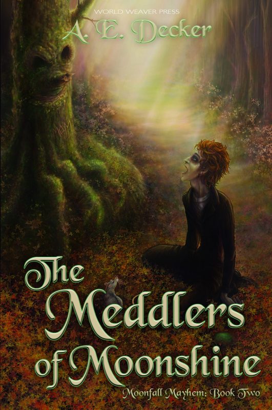
More info →MEDDLERS OF MOONSHINE
Something is rotten in the town of Widget, and Rags-n-Bones knows it's all his fault.
More info →
A NAUGHTY CHRISTMAS CAROL
What if Scrooge was a tall, dark, and oh so sexy Wall Street billionaire?
More info →Newsletter
Contributing Authors
Search A Slice of Orange
Find a Column
Archives
Authors in the Bookstore
- A. E. Decker
- A. J. Scudiere
- A.J. Sidransky
- Abby Collette
- Alanna Lucus
- Albert Marrin
- Alice Duncan
- Alina K. Field
- Alison Green Myers
- Andi Lawrencovna
- Andrew C Raiford
- Angela Pryce
- Aviva Vaughn
- Barbara Ankrum
- Bethlehem Writers Group, LLC
- Carol L. Wright
- Celeste Barclay
- Christina Alexandra
- Christopher D. Ochs
- Claire Davon
- Claire Naden
- Courtnee Turner Hoyle
- Courtney Annicchiarico
- D. Lieber
- Daniel V. Meier Jr.
- Debra Dixon
- Debra H. Goldstein
- Debra Holland
- Dee Ann Palmer
- Denise M. Colby
- Diane Benefiel
- Diane Sismour
- Dianna Sinovic
- DT Krippene
- E.B. Dawson
- Emilie Dallaire
- Emily Brightwell
- Emily PW Murphy
- Fae Rowen
- Faith L. Justice
- Frances Amati
- Geralyn Corcillo
- Glynnis Campbell
- Greg Jolley
- H. O. Charles
- Jaclyn Roché
- Jacqueline Diamond
- Janet Lynn and Will Zeilinger
- Jaya Mehta
- Jeff Baird
- Jenna Barwin
- Jenne Kern
- Jennifer D. Bokal
- Jennifer Lyon
- Jerome W. McFadden
- Jill Piscitello
- Jina Bacarr
- Jo A. Hiestand
- Jodi Bogert
- Jolina Petersheim
- Jonathan Maberry
- Joy Allyson
- Judy Duarte
- Justin Murphy
- Justine Davis
- Kat Martin
- Kidd Wadsworth
- Kitty Bucholtz
- Kristy Tate
- Larry Deibert
- Larry Hamilton
- Laura Drake
- Laurie Stevens
- Leslie Knowles
- Li-Ying Lundquist
- Linda Carroll-Bradd
- Linda Lappin
- Linda McLaughlin
- Linda O. Johnston
- Lisa Preston
- Lolo Paige
- Loran Holt
- Lynette M. Burrows
- Lyssa Kay Adams
- Madeline Ash
- Margarita Engle
- Marguerite Quantaine
- Marianne H. Donley
- Mary Castillo
- Maureen Klovers
- Megan Haskell
- Melanie Waterbury
- Melisa Rivero
- Melissa Chambers
- Melodie Winawer
- Meriam Wilhelm
- Mikel J. Wilson
- Mindy Neff
- Monica McCabe
- Nancy Brashear
- Neetu Malik
- Nikki Prince
- Once Upon Anthologies
- Paula Gail Benson
- Penny Reid
- Peter Barbour
- Priscilla Oliveras
- R. H. Kohno
- Rachel Hailey
- Ralph Hieb
- Ramcy Diek
- Ransom Stephens
- Rebecca Forster
- Renae Wrich
- Roxy Matthews
- Ryder Hunte Clancy
- Sally Paradysz
- Sheila Colón-Bagley
- Simone de Muñoz
- Sophie Barnes
- Susan Kaye Quinn
- Susan Lynn Meyer
- Susan Squires
- T. D. Fox
- Tara C. Allred
- Tara Lain
- Tari Lynn Jewett
- Terri Osburn
- Tracy Reed
- Vera Jane Cook
- Vicki Crum
- Writing Something Romantic
Affiliate Links
A Slice of Orange is an affiliate with some of the booksellers listed on this website, including Barnes & Nobel, Books A Million, iBooks, Kobo, and Smashwords. This means A Slice of Orange may earn a small advertising fee from sales made through the links used on this website. There are reminders of these affiliate links on the pages for individual books.


