Use Your Own Photos As Background Images In Your Graphics
March 12, 2023 by Denise M. Colby in category The Writing Journey by Denise Colby tagged as background images, Marketing for Authors, Social Media, Visual Content MarketingBackground images in graphics is something we don’t talk about much. Yet, when you see a social media graphic with a great quote, there most always is a graphic behind the words that helps communicate the message. So, if you plan to create your own graphics, choosing the photos you use in those graphics matter.
What to use as a background image
Nature is a popular choice, especially sunsets, sunrises, flowers, mountains or waterfalls. Images with animals are selected frequently as well, showing them all in their cute glory or in varying circumstances that can be funny or memorable. When we look at humorous posts, an image with a funny face or situation lends to the message.

The colors you use in your backgrounds is just as important. Sometimes the photo itself in the background may drive what color you use for your text in order for them to blend. But keep in mind, colors represent different things to people. Look up color choices, if interested in what emotion you want to convey in your graphics. And then choose your background image color accordingly.

I found this definition on the internet about using backgrounds in graphic design.
Backgrounds are the foundation of a successful composition. Background textures and colors create depth and contrast, allowing graphics to stand out and get noticed. Well-composed background images can help create space for you to overlay text.
Incorporating your brand in your background choices
Something to keep in mind is your brand. What is your brand? Specific colors in your brand? Do you have animals in your stories? Or what settings do you write most of your scenes? These all are ideas of what to use as background images in your graphics.
For example, if you write about cowboys, then horses and sunsets might be good options to include in your graphics. Every graphic should include your branding in some way. And think outside of the box a little bit to expand your branding content.
I found some 12 x 12 paper I liked and gave a historical look that I wanted in my background images. As I started using these to take pictures of books, bookmarks and other small items in my graphics, I liked the results.


Out of the few I first bought, I tend to use the same ones over and over because I like how the wood contrasts with all the types of images I’m creating.


If you know your brand and have a look, this is a great way to build consistency in your content. Try some things. It’s the only way to know what works and what doesn’t.
Taking your own photos and using them as background images
It’s important to note to not just find any photo off the internet. That’s actually taking someone else’s intellectual property. Instead you can find photos for free from certain apps, as well as purchase photos from several different resources.
Taking your own photos is a great way to create content. See if you can find things around you to be used as background images.

Start seeing backgrounds in the world around you
Some of this will take practice, but keeping an eye out for what you like is important. You have a brand and your brand is your style. Think about your readers, but I would focus on things that speak to you as well. A look, a vibe. All of which will come out as you build your content in your social media.
Be careful not to include anything people would be able to recognize. That’s not the point of a background image. And you don’t want something on your graphics that is someone else’s brand.
I’ve created a folder on my phone in my photos that is for background images. When I take a picture of something that I think would make a great background I save it in there so I can find it easily.
A little Disney magic in the background
One of my favorite places to find image backgrounds is Disneyland. Everything is clean and colorful and there are lots of choices available, from rock walls, boards, or the pathways. If you look around you can see things that you hadn’t noticed before, but they are part of the atmosphere. That’s what you want for your background photos. Something that blends in nicely but is clean and aestheticly pleasing.


I love going to Disneyland and taking pictures of the things around me. Disney thinks through everything, and it’s given me some great ideas for image backgrounds. Here are some additional examples:


If you zoom in close on something it can provide a completely different perspective and make the perfect background image.
I hope these examples give you some ideas for you to use in your content in the future.
Thanks for reading!
Denise M. Colby loves to write blog posts on marketing and SEO. She also loves to write about her word of the year. She creates social media graphics to highlight quotes from her word of the year. Take a look at this blog post on her 2022 word Work for additional ideas. Or the graphics created for her 2021 word Wisdom using the 12 x 12 paper mentioned above. Check out the new ones she’s created for her 2023 word Change. Or see more on her instagram or facebook pages.
0 0 Read moreVisual Content Marketing for the Confused and Terrified Writer with Elena Dillon
May 7, 2017 by marianne h donley in category Writing: It's a Business tagged as Elena Dillion, Online Classes, Visual Content Marketing
Visual Content Marketing for the Confused and Terrified Writer
Instructor: Elena Dillon
Cost: $79
Dates: On Demand at Teachable.com
What is visual content and why do you need it for your marketing strategy? And how does this apply to your author business?
The answer is simple.
Visual content is anything that uses pictures, graphics, video, etc. When you see a GIF of cats falling off tables? That’s visual content. A pretty graphic with a quote from a book? Visual Content. Those fabulous cooking videos where they make a cinnamon roll apple pie in twenty seconds? Visual content.
It’s what will get your content seen. As a matter of fact, statistically your readers are 44% more likely to engage with visual content. Hmmm. 44%? Hard to ignore. We all want to work smarter not harder, right? In this class, you will learn:
- How to decide what kind of visuals will work for you and your business
- How to create all kinds of visuals
- How to make one piece of content work in many different ways
- Drive traffic where you want it to go (your website, lead page, Amazon or other retailer page)
- Save time and effort in your marketing efforts
Who should take this class?
This class for you if you’ve never created any kind of graphics on your own. It’s for authors who need to learn how to create visual content for their author business and are unsure about using new technology. We will go over:
- Strategies for smarter marketing
- Tools that make visual content easier to create and more manageable
- How to plan out your content and marketing so it takes up less precious writing time.
And believe it or not? I’ll make it fun. I’ll teach you how to create a graphic while you’re standing in line for coffee. =)
About the instructor:
 Who Am I?
I’m Elena Dillon, an author of the award winning Young Adult Breathe series. When I’m not writing, I love to help my author friends with technology and social media. I’ve taught Social Media for the Confused and Terrified, Pinterest for the Confused and Terrified, Visual Content for Authors and spoken at numerous conferences, chapters and groups about social media and indie publishing.
Most of the time, I’m a wife to my husband of twenty-six years, mom to my two grown kids and servant to my high-maintenance English bulldog, Brutus, while I wait, not so patiently, for grandbabies.
Enrollment Information
Visual Content Marketing for the Confused and Terrified Writer
Instructor: Elena Dillon
Cost: $79
Dates: On Demand at Teachable.com
3 0 Read moreAffiliate Links
A Slice of Orange is an affiliate with some of the booksellers listed on this website, including Barnes & Nobel, Books A Million, iBooks, Kobo, and Smashwords. This means A Slice of Orange may earn a small advertising fee from sales made through the links used on this website. There are reminders of these affiliate links on the pages for individual books.
Search A Slice of Orange
Find a Column
Archives
Featured Books
SHOULD HAVE PLAYED POKER
Truth and integrity aren’t always what we’ve been taught to believe, and one could die making that discovery.
More info →
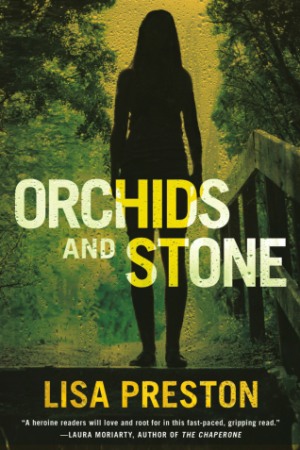
ORCHIDS AND STONE
They’re trying to take me. Help! Help me, please.
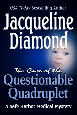
More info →THE CASE OF THE QUESTIONABLE QUADRUPLET
A patient shares a puzzling secret with Dr. Darcy—and then someone kills her.
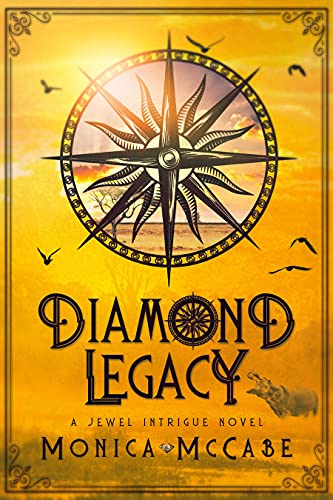
More info →DIAMOND LEGACY
Diamonds ruined his life and he’s on a path of revenge.
More info →Newsletter
Contributing Authors
Search A Slice of Orange
Find a Column
Archives
Authors in the Bookstore
- A. E. Decker
- A. J. Scudiere
- A.J. Sidransky
- Abby Collette
- Alanna Lucus
- Albert Marrin
- Alice Duncan
- Alina K. Field
- Alison Green Myers
- Andi Lawrencovna
- Andrew C Raiford
- Angela Pryce
- Aviva Vaughn
- Barbara Ankrum
- Bethlehem Writers Group, LLC
- Carol L. Wright
- Celeste Barclay
- Christina Alexandra
- Christopher D. Ochs
- Claire Davon
- Claire Naden
- Courtnee Turner Hoyle
- Courtney Annicchiarico
- D. Lieber
- Daniel V. Meier Jr.
- Debra Dixon
- Debra H. Goldstein
- Debra Holland
- Dee Ann Palmer
- Denise M. Colby
- Diane Benefiel
- Diane Sismour
- Dianna Sinovic
- DT Krippene
- E.B. Dawson
- Emilie Dallaire
- Emily Brightwell
- Emily PW Murphy
- Fae Rowen
- Faith L. Justice
- Frances Amati
- Geralyn Corcillo
- Glynnis Campbell
- Greg Jolley
- H. O. Charles
- Jaclyn Roché
- Jacqueline Diamond
- Janet Lynn and Will Zeilinger
- Jaya Mehta
- Jeff Baird
- Jenna Barwin
- Jenne Kern
- Jennifer D. Bokal
- Jennifer Lyon
- Jerome W. McFadden
- Jill Piscitello
- Jina Bacarr
- Jo A. Hiestand
- Jodi Bogert
- Jolina Petersheim
- Jonathan Maberry
- Joy Allyson
- Judy Duarte
- Justin Murphy
- Justine Davis
- Kat Martin
- Kidd Wadsworth
- Kitty Bucholtz
- Kristy Tate
- Larry Deibert
- Larry Hamilton
- Laura Drake
- Laurie Stevens
- Leslie Knowles
- Li-Ying Lundquist
- Linda Carroll-Bradd
- Linda Lappin
- Linda McLaughlin
- Linda O. Johnston
- Lisa Preston
- Lolo Paige
- Loran Holt
- Lynette M. Burrows
- Lyssa Kay Adams
- Madeline Ash
- Margarita Engle
- Marguerite Quantaine
- Marianne H. Donley
- Mary Castillo
- Maureen Klovers
- Megan Haskell
- Melanie Waterbury
- Melisa Rivero
- Melissa Chambers
- Melodie Winawer
- Meriam Wilhelm
- Mikel J. Wilson
- Mindy Neff
- Monica McCabe
- Nancy Brashear
- Neetu Malik
- Nikki Prince
- Once Upon Anthologies
- Paula Gail Benson
- Penny Reid
- Peter Barbour
- Priscilla Oliveras
- R. H. Kohno
- Rachel Hailey
- Ralph Hieb
- Ramcy Diek
- Ransom Stephens
- Rebecca Forster
- Renae Wrich
- Roxy Matthews
- Ryder Hunte Clancy
- Sally Paradysz
- Sheila Colón-Bagley
- Simone de Muñoz
- Sophie Barnes
- Susan Kaye Quinn
- Susan Lynn Meyer
- Susan Squires
- T. D. Fox
- Tara C. Allred
- Tara Lain
- Tari Lynn Jewett
- Terri Osburn
- Tracy Reed
- Vera Jane Cook
- Vicki Crum
- Writing Something Romantic
Affiliate Links
A Slice of Orange is an affiliate with some of the booksellers listed on this website, including Barnes & Nobel, Books A Million, iBooks, Kobo, and Smashwords. This means A Slice of Orange may earn a small advertising fee from sales made through the links used on this website. There are reminders of these affiliate links on the pages for individual books.
