Heck Yeah! E-Covers That Seduce & Sell
April 15, 2011 by Rebecca Forster in category The Write Life by Rebecca Forster tagged as DYI, e-books, e-covers, Rebeca Forster
 |
| See all my covers at: http://www.rebeccaforster.com/ |
by Rebecca Forster
I doubt this will come as a surprise, but ‘pretty’ sells. So does intriguing, shocking, soothing and sexy. That’s why I spent the last three weeks sweating over cover designs for my backlist romances (all of which I hope you’ll check out for your E-reader) and redesigning my thriller covers.
Why, you may wonder, did this exercise create such angst? After all, these are only E-covers. Nobody will run their thumb over the richly embossed type, check to weight of the stock or touch it in a bookstore. This isn’t a ‘real’ cover on a ‘real’ book. And that is my point exactly. These covers are more important than a paper because they will live on in perpetuity.
In this new publishing reality authors who have backlists and don’t own the rights to their covers must now become designers; indie authors who have never had the benefit of seeing their work transformed into a visual face a daunting task of identifying the soul of their books. Bottom line, unlike paper, an E-cover’s impact will be farther reaching than any of us can even imagine.
In the old days an author might reproduce their cover image on bookmarks and mugs. In this brave new world, E-covers pop up as thumbnails on Facebook, Linked-In and other social media posts. They are broadcast to readers of blogs and reviewers who promote your work. An E-cover makes a statement on your own website. An E-book cover is brought up full-size and full color on most readers. An E-book cover sets the tone for your book in a way that a paper cover never could because you – the author – have designed it and that is the truly exquisite bottom line.**
No longer am I at the mercy of a New York art director working off a synopsis of the book we spent months writing. Never again will I have a cover where Lady Justice had a sex change and became a sword-toting Roman guy. I have seen the last of a beautiful ocean on the cover of my book that is set in the high desert of California. Hurrah! I have taken the beaches of cover design, and planted my flag and you can too.
I must confess that initially I was like a young soldier rushing into war without realizing how important the battle was. I lucked out with my Witness Series covers but others looked amateurish, weak and unmemorable. I had that revelation as I readied my romance backlist for E-publication. I was determined to make my covers as easily identifiable as my writing style so when faced with the prospect of creating a minimum of 8 new covers, I knew I needed a plan. I studied E-covers of books I admired and those on the top seller lists. I began to experiment. I realized that, like a first draft of a book, my covers were not perfect the first time out. I began to understand that I had to kick everything up a notch to get noticed.
The new covers now reflect the theme of each book or are evocative of the mood of that work. With the romances and women’s fiction in particular I tried to limit the use of full-on portrait photography in order not to inhibit the romantic reader’s imagination. For me, blocking and color worked for the romances. For other authors, flowers and pastels might be the key to success. For my thrillers, I decided to go darker with ominous and/or graphic images. Though there are no hard and fast rules, here are some guidelines that worked for me:
• Clean is better than fussy
• People (especially parts of people) are intriguing***
• Experiment. Odd colors and disparate type faces can to work together and create drama
• The covers should reflect the tone of the book
• Slugs should be tight and to the point
• Spend a little money on stock photos (I use ‘small’).
• Plug in image search words that aren’t obvious.
• Use PowerPoint portrait setting for your design. The pixel height and width will be perfect.
So, Heck Yeah! Get on top of the the covers. Your E-career will thank you for it.****
*See more of my handiwork at http://www.rebeccaforster.com/ .
**Even if you had a designer, they worked at your direction. Own that cover!
***See The Reckless Ones – my favorite partial body shot.
****The same thoughts hold true for E-packaging!
Affiliate Links
A Slice of Orange is an affiliate with some of the booksellers listed on this website, including Barnes & Nobel, Books A Million, iBooks, Kobo, and Smashwords. This means A Slice of Orange may earn a small advertising fee from sales made through the links used on this website. There are reminders of these affiliate links on the pages for individual books.
Search A Slice of Orange
Find a Column
Archives
Featured Books
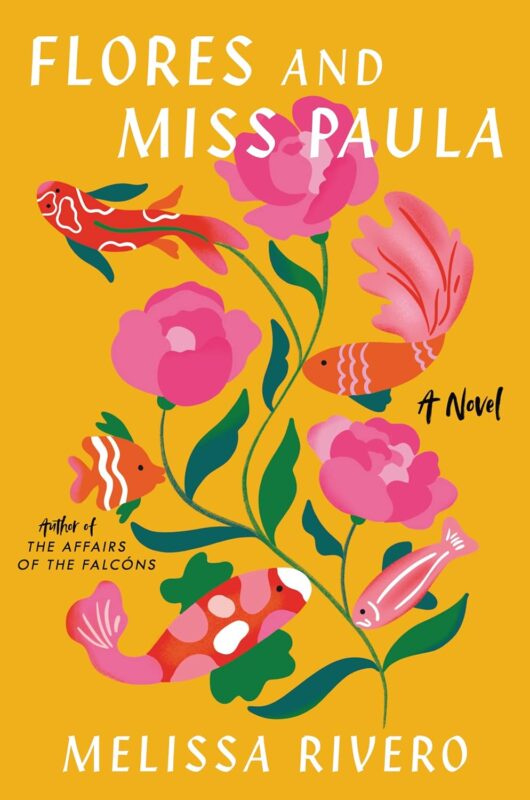
FLORES AND MISS PAULA
Forgive me if I failed you. Remember that I always loved you.
More info →THE OTHER SIDE OF THE RIDGE, NEW YORK, 1930
Dan Rodin has once again transcended time...
More info →Newsletter
Contributing Authors
Search A Slice of Orange
Find a Column
Archives
Authors in the Bookstore
- A. E. Decker
- A. J. Scudiere
- A.J. Sidransky
- Abby Collette
- Alanna Lucus
- Albert Marrin
- Alice Duncan
- Alina K. Field
- Alison Green Myers
- Andi Lawrencovna
- Andrew C Raiford
- Angela Pryce
- Aviva Vaughn
- Barbara Ankrum
- Bethlehem Writers Group, LLC
- Carol L. Wright
- Celeste Barclay
- Christina Alexandra
- Christopher D. Ochs
- Claire Davon
- Claire Naden
- Courtnee Turner Hoyle
- Courtney Annicchiarico
- D. Lieber
- Daniel V. Meier Jr.
- Debra Dixon
- Debra H. Goldstein
- Debra Holland
- Dee Ann Palmer
- Denise M. Colby
- Diane Benefiel
- Diane Sismour
- Dianna Sinovic
- DT Krippene
- E.B. Dawson
- Emilie Dallaire
- Emily Brightwell
- Emily PW Murphy
- Fae Rowen
- Faith L. Justice
- Frances Amati
- Geralyn Corcillo
- Glynnis Campbell
- Greg Jolley
- H. O. Charles
- Jaclyn Roché
- Jacqueline Diamond
- Janet Lynn and Will Zeilinger
- Jaya Mehta
- Jeannine Atkins
- Jeff Baird
- Jenna Barwin
- Jenne Kern
- Jennifer D. Bokal
- Jennifer Lyon
- Jerome W. McFadden
- Jill Piscitello
- Jina Bacarr
- Jo A. Hiestand
- Jodi Bogert
- Jolina Petersheim
- Jonathan Maberry
- Joy Allyson
- Judy Duarte
- Justin Murphy
- Justine Davis
- Kat Martin
- Kidd Wadsworth
- Kitty Bucholtz
- Kristy Tate
- Larry Deibert
- Larry Hamilton
- Laura Drake
- Laurie Stevens
- Leslie Knowles
- Li-Ying Lundquist
- Linda Carroll-Bradd
- Linda Lappin
- Linda McLaughlin
- Linda O. Johnston
- Lisa Preston
- Lolo Paige
- Loran Holt
- Lynette M. Burrows
- Lyssa Kay Adams
- Madeline Ash
- Margarita Engle
- Marguerite Quantaine
- Marianne H. Donley
- Mary Castillo
- Maureen Klovers
- Megan Haskell
- Melanie Waterbury
- Melisa Rivero
- Melissa Chambers
- Melodie Winawer
- Meriam Wilhelm
- Mikel J. Wilson
- Mindy Neff
- Monica McCabe
- Nancy Brashear
- Neetu Malik
- Nikki Prince
- Once Upon Anthologies
- Paula Gail Benson
- Penny Reid
- Peter Barbour
- Priscilla Oliveras
- R. H. Kohno
- Rachel Hailey
- Ralph Hieb
- Ramcy Diek
- Ransom Stephens
- Rebecca Forster
- Renae Wrich
- Roxy Matthews
- Ryder Hunte Clancy
- Sally Paradysz
- Sheila Colón-Bagley
- Simone de Muñoz
- Sophie Barnes
- Susan Kaye Quinn
- Susan Lynn Meyer
- Susan Squires
- T. D. Fox
- Tara C. Allred
- Tara Lain
- Tari Lynn Jewett
- Terri Osburn
- Tracy Reed
- Vera Jane Cook
- Vicki Crum
- Writing Something Romantic
Affiliate Links
A Slice of Orange is an affiliate with some of the booksellers listed on this website, including Barnes & Nobel, Books A Million, iBooks, Kobo, and Smashwords. This means A Slice of Orange may earn a small advertising fee from sales made through the links used on this website. There are reminders of these affiliate links on the pages for individual books.

