Cover Me
August 15, 2018 by Rebecca Forster in category The Write Life by Rebecca Forster tagged as books, communication, cover, cover design, covers, Craft, design, writing I find it difficult to write – or speak – in short form. To communicate, I must take not just the road less traveled but also all roads in between. My children say a conversation with me is like trying to keep your head above water in the ocean while being knocked about by swells and the occasional rogue wave. I’m not sure if my husband share’s this opinion. Then again, I’m not sure my husband’s hearing is up to snuff.
When my boys were small they begged me to write a children’s book. I ended with fifty thousand words and killed off most of the characters, so my one effort really wasn’t suitable for children (it was, however, the basis for a later novel).
I had a similar problem with lullabies. As a young mother I realized I didn’t know any. Still, I was determined to be maternal and sing my boys to sleep. In those days Cops was all the rage and the theme song was catchy, so I softly sang “bad boys, bad boys, whatcha going to do when Sheriff Brown comes for you?” Years later, my sons told me that they would stare wide-eyed into the night waiting for the police to come get them because they were pretty sure they were bad boys. Luckily, they have stopped asking me to write a children’s book and these days no one wants to hear me sing.
All this brings me to the point. It can be unbearably difficult for a cover designer to work with someone like me. Up front I am apologizing to Hadleigh O.Charles (cover designer) for my inability to be decisive, my tendency to forward six thousand royalty free photos for her consideration, and my failure to understand that the blue stripes at the top of an email mean there is something for me to download. Since I have learned nothing from my children’s assessment of my communication style, my emails to Hadleigh are like the verbal pinging of a steel ball inside a bell.
E-mail #1: Hadleigh, are you there? Hadleigh? I need a cover.
Hadleigh’s response: I’m here
E-mail #2: Well, it’s for the (fill in the blank) series and the story is about (fill in the character) and (fill in three thousand plot points) and I’m attaching a few images – but then again you probably have some ideas – so shoot me what you think and – oh, wait – how’s the dog? Hope it’s not too hot where you are. But then again the story really is about people buried in the desert – then again maybe a half naked woman on the front would be better. . . in silhouette, of course. . .”
Hadleigh’s response: Silence
E-mail #3 (usually a minute later so to be fair she hasn’t had time to respond): Hadleigh, really, you do what you want, but I don’t think we should have blood. Do you think we should have blood? Have you seen other thriller authors use a lot of blood? I’m going to visit my mom so don’t worry if you don’t hear from me for a day. . . Still, here are a couple of links – okay ten links – maybe more – so you can take a look at the top ten (maybe more) bestsellers in my genre – when you have time. But I would like to be a little different. Like them but not the same. Better. You know? Like bestseller better. No hurry. I’m seriously going to visit my mom overnight.
Hadleigh’s response: Silence (perhaps she knows that I am writing email #4 within five minutes of email #3)
E-mail #4: Five pages peppered with ideas, apologies for bothering her, explanations, useless terms that I think describe typeface, color and composition.
I hit DELETE.
Hadleigh’s response (a day or so later): Three beautiful covers that somehow incorporate tiny specks of rational thought mined from my manic ramblings. She also sends an update on her dog.
Unlike my children, Hadleigh does not lay wide-eyed and paralyzed by my avalanche of input, yet like my children she manages to figure out what’s important. Hadleigh, love you and every other cover designer out there. So happy you have all us authors covered.
 REBECCA FORSTER started writing on a crazy dare. Now she is a USA Today and Amazon best selling author with over 30 books to her name. These include the acclaimed Witness Series, Josie Bates Thrillers and her latest, The Finn O’Brien Thrillers. She is married to a superior court judge and is the mother of two grown children. When not writing, Rebecca is traveling the world looking for inspiration, sewing, playing tennis and reading.
Sign up for Rebecca’s spam-free mailing list
Get your 2-Book Starter Library for Free!
Book #1 of the bestselling Josie Bates Thriller Series
HOSTILE WINTESS
And the exclusive Spotlight Novella
HANNAH’S DIARY
Rebecca’s
2 0 Read more
Some summery covers to go with the weather
July 4, 2017 by H. O. Charles in category Art, Cover, Design by H. O. Charles, Writing tagged as art, book covers, designThat most sumptuous of seasons is now in full swing (in the northern hemisphere, at least) – there is a big, yellow thing in the sky, Wimbledon is on, and it’s the fourth of July!

No, really, I hope you all have a wonderful day of celebrations on your side of the pond. I shall raise a beer and a punnet of strawberries in each of your respective honours, even if I cannot guarantee queenie will.
On that summery note, I’ve picked out some summery-covered new releases. I cannot comment on the content, but what unites each of these is that they are recently published, that they have a very popular feel, and are therefore designed to be picked up by holiday-makers in their masses. Let’s go ahead and judge each of these books by their covers…
![Holiday in the Hamptons by [Morgan, Sarah]](https://i0.wp.com/images-eu.ssl-images-amazon.com/images/I/514Dy-FjbKL.jpg?resize=159%2C253&ssl=1)
Holiday in the Hamptons by Sarah Morgan
Summer cover checklist: palm trees, sunset, summer dress, sea view and even a lighthouse! A prerequisite of all summery covers is that they must include the colour blue, because blue skies make us happy and remind us of sunbathing, or something along those lines. Extra points go to this cover’s designer for obeying the rule of thirds.

Read, Write, Love at Seaside by Addison Cole
Aside from the colour blue, another thing you’ll find these covers have in common is the scripty style title writing. It’s a kind of code to the potential reader that says, “Hey, I’m popular, light-hearted fiction and JUST the sort of book you like to read on the beach!” What I like about this cover in particular is the way the artist has stuck to a limited palette – purple, blue and beige. It yields a much cleaner effect overall, and is visually quite satisfying. Points for including the cute dog in the beach bag, but I do hope the owner remembered to pack poo bags in there too.
![I Wish You Happy: A Novel by [King, Kerry Anne]](https://i0.wp.com/images-eu.ssl-images-amazon.com/images/I/51yeBAnBumL.jpg?resize=170%2C255&ssl=1)
I Wish You Happy by Kerry Anne King
Ah, some very seasonal dandelions! We’ve ventured away from the seaside, and are now running gaily through a summer field. Impressively, the character has managed to locate some fresh dandelions when all the others are expired, and hasn’t been savaged by patch of nettles and thistles, but hey, realism isn’t always quite as romantic as an artist would like. We’re back to the rule of thirds with this one, but I’m not sure I like the orange as part of the colour palette. Put it down to personal taste.
![The Summer House: A gorgeous feel good romance that will have you hooked by [Hale, Jenny]](https://i0.wp.com/images-eu.ssl-images-amazon.com/images/I/51hCaEaHD%252BL.jpg?resize=183%2C277&ssl=1)
The Summer House by Jenny Hale
You know, there’s photoshopping and there’s photoshopping. Perhaps this one is supposed to look cartoony and superimposed – I’m not sure, but it does do well in communicating that it’s a light summer read for you to breeze through on your hols (and it’s currently #215 in the UK Kindle chart, so clearly that fake photoshopping is not harming its sales). We have plenty on our summer cover checklist here: blue skies, voile curtains, flowers, beach, yachts and even a phallic lighthouse. How it does go against the grain is with the lack of scripty writing in the title, and instead the artist has chosen lowercase serif in a light colour, which is a reliable standard in pop fiction. Oh yeah, and it has ‘Summer’ in the title! Dead giveaway, but helpful for Amazon search bait.
![Summer at Buttercup Beach: A gorgeously uplifting and heartwarming romance by [Martin, Holly]](https://i0.wp.com/images-eu.ssl-images-amazon.com/images/I/51DoF%252BbJz1L.jpg?resize=182%2C280&ssl=1)
Summer at Buttercup Beach by Holly Martin
I challenge you to come up with a more summery title than this one! The colour palette has been limited to entirely summery colours, there’s beach, there’s sky, ferns and a deck chair. There’s nothing challenging in the image, which indicates there’s probably nothing challenging inside, either. It just screams to be added to your holiday reading collection with a happy, brainless grin upon its papery face.
So there’s my very brief summary of summery popular covers. If you want to tell your readers that popular, sunny fiction is the content of your novel, then these are the exactly the sorts of designs you should look at emulating. Now, I’m off to sit outside in the garden. Where was that beer…?
3 0 Read moreCover review: Half ‘n’ Half Covers
May 8, 2017 by H. O. Charles in category Art, Cover, Design by H. O. Charles tagged as art, book covers, covers, design, graphic designMy eye was caught this month by these rather attractive, bipartite covers in the Thriller section:
What I really like about these three covers is the way they separate their titles into two halves using both contrasting colours and placement inside the background imagery.
Not only does this make a striking image, it also communicates the essence of the titles before the reader so much as thinks about the meaning of the words within them.
They tell you that there are two stories to be told, two points of view – a this and a that. Of course, the real world is not always so simple, and the stories within may not be either, but our human brain likes things to be reduced to simple statements, which is exactly what these covers are.
The great thing about this type of cover design is that it can be applied to so many novels, especially in something like the crime/thriller genre, where there is a question of innocence/guilt, or was it him/her? etc.
But the title has to work with the design. “He Said/She Said” is easy to balance and mirror, as is “My Husband the Stranger”. With “Two Sisters”, however, the designer has to forget the idea of perfect symmetry, and tie the words instead to background images that balance them out. Even though the words are different sizes, you are still left with the impression that they represent two individuals, who are likely quite contrasting in character, standing in that landscape.
So there you go – another design route to consider for your next novel!
I thought I’d also include a couple of “cover picks of the month” this time round, because they were so pretty (and tie in with what I was nattering on about last month re: minimalist titles and their covers)
Aren’t they pretty? And also slightly spooky?!
 H.O .Charles, a cover designer and author, was born in Northern England, but now resides in a beige house in Suffolk.
Charles has spent many years at various academic institutions, and really ought to get on with writing a PhD, but frequently becomes distracted by writing fantasy fiction instead.
Hobbies include being in the sea, being by the sea and eating things that come out of the sea.
Cover designs: www.hadleighdesign.blogspot.com
Author: www.hocharles.com
3 0 Read moreWhy Cover Designers Want Your Title to Be as Short as Possible (unlike this one)
April 8, 2017 by H. O. Charles in category Art, Cover, Design by H. O. Charles tagged as art, covers, designI’ll let you into a little secret: wordy titles (and also looong author names, if I’m honest) are HARD WORK for a cover designer. Really, we should be charging extra for them. Perhaps £10 extra per letter for any word more than one syllable long would be sufficient. The Curious Incident of the Dog in the Night-Time would have netted me £380 before I’d even started doing any art…
* laughs dreamily *
I joke, of course, but if you are into art and design, and you recognise that a reader will judge a cover before they judge a title, then you might start to see how less is more…
Here’s a worked example (very hastily put together, I should add), but hopefully it will show you how a short title (and even author name) can help you achieve that impactful, minimalist look.
The first cover is simple, no-fuss and easy to read. The text doesn’t have to be huge, and I can keep everything neatly squared.

If I want to go for a really modern approach, I can blur out the background entirely, which gives the title text much more weight, and gives me the freedom move the author name about. I can even play with light. Of course, this would work better with a more recognisable image than a Chinese archway, but you get the general idea…

Then we have a longer author name. The colours I can use for it are now more limited if I want it to remain legible, and it needs balancing out with some text at the bottom. Still, it looks fine because the most important piece of text (the title in this case – Andy Pantaloons is not that famous) is short.

Things are getting tricky with this longer title! At this point, I would usually change the font and tweak the letter spacings to see if it would look better, but for the purposes of explaining the impact of title length, I’ve left it the same. It’s still just about okay, but if the author wants more images, the chances are they will fight for attention with the text.

Time to pack my bag and go home! What a mess! There is just too much image for a title that size, and so I would either consider getting rid of the arch altogether, or throwing my laptop against the wall.

Of course, it is down to the designer to take whatever title you throw at them and make it look good, and we have a tonne of tricks for doing that, but if you like the minimalist look, and you want your cover to appear modern, AND there is an idea you want to convey in pictures, then consider a short title paired with a single, powerful image. This is one of my favourite examples from another designer (Eric White):

All of that said, here’s how a long title can look good. This cover is by Ervin Serrano, who did a brilliant job with the “The Invention of Murder: How the Victorians Revelled in Death and Detection and Created Modern Crime” but you can see how he had to sacrifice images (almost) altogether in order to make the overall design work and remain clear.

And of course, certain genres *demand* busy artwork, so I’ll neatly lever my most recent fantasy cover design in here, and thank you for reading!

 H.O .Charles, a cover designer and author, was born in Northern England, but now resides in a beige house in Suffolk.
Charles has spent many years at various academic institutions, and really ought to get on with writing a PhD, but frequently becomes distracted by writing fantasy fiction instead.
Hobbies include being in the sea, being by the sea and eating things that come out of the sea.
Cover designs: www.hadleighdesign.blogspot.com
Author: www.hocharles.com
2 0 Read moreWho’s ever seen a Christmas Piano Tree? by Jina Bacarr
December 11, 2014 by A Slice of Orange in category Archives tagged as book cover, Christmas, Christmas eve, Christmas tree, design, holiday romance, military, piano, romance, soldier, sweet romance, wounded warriorI asked myself that question when I was looking for ideas for a cover for my holiday romance, A Christmas Piano Tree.
You can’t stick a picture of a Christmas tree on a piano…and the story is a romance. Got to have gorgeous hero and pretty heroine on the cover…but where to start?
That’s when I decided to take a cover class from Andris Bear www.andrisbear.com and Lily Smith http://www.coversbylily.com through the Heart of Carolina Romance Writers.
http://heartofcarolina.org
I love www.Dreamstime.com for stock photos, and since I have somewhat of an art background, I enjoy the process of cover design (once upon another life I studied design for the theatre). Here is a Spanish-theme sketch I did for a Vegas-type extravaganza.
I’ve always had a love for design since I was a kid and I drew pictures in my dad’s encyclopedias (remember those?).
Here’s a sketch for a dress design I did at age 11. Somehow it has survived numerous moves around the country and overseas…
What kind of covers do you enjoy for Christmas books?
I totally enjoyed putting the cover together for “A Christmas Piano Tree,†the story of a pretty young war widow who re-discovers the magic of the holiday season with the help of a homeless vet and an old piano. I hope you like it.
Check out my Christmas Piano Tree Pinterest board!

Cyber Santa is asking for your vote…
“The Christmas Piano Tree” is included in the December Cover Wars on Masqueradecrew.blogspot.com!
Check out all the wonderful covers and vote for your favorites…
~Jina
Vote for The Christmas Piano Tree or one of several others: http://buff.ly/1vD4xsW
Affiliate Links
A Slice of Orange is an affiliate with some of the booksellers listed on this website, including Barnes & Nobel, Books A Million, iBooks, Kobo, and Smashwords. This means A Slice of Orange may earn a small advertising fee from sales made through the links used on this website. There are reminders of these affiliate links on the pages for individual books.
Search A Slice of Orange
Find a Column
Archives
Featured Books
OPERATION SECOND CHANCE
His guilt tore them apart
Can the truth set them free?
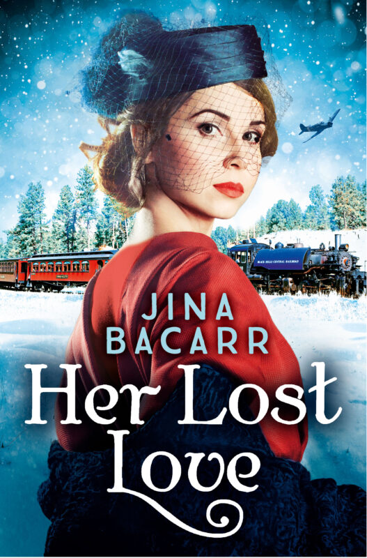
HER LOST LOVE
All she wants for Christmas is to save the man she loves…
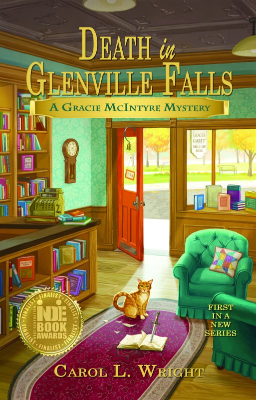
More info →DEATH IN GLENVILLE FALLS
For Gracie McIntyre opening a new-and-used book shop gives her more than she bargains for.
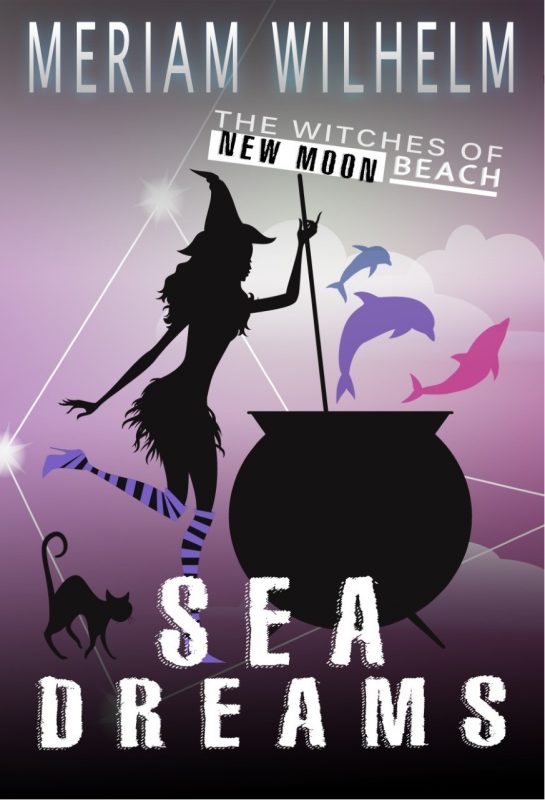
More info →SEA DREAMS
Can help from a lavender-eyed sea witch, a few enchanted cupcakes and a touch of New Moon magic really rescue a once famous now washed up artist from himself?
More info →Newsletter
Contributing Authors
Search A Slice of Orange
Find a Column
Archives
Authors in the Bookstore
- A. E. Decker
- A. J. Scudiere
- A.J. Sidransky
- Abby Collette
- Alanna Lucus
- Albert Marrin
- Alice Duncan
- Alina K. Field
- Alison Green Myers
- Andi Lawrencovna
- Andrew C Raiford
- Angela Pryce
- Aviva Vaughn
- Barbara Ankrum
- Bethlehem Writers Group, LLC
- Carol L. Wright
- Celeste Barclay
- Christina Alexandra
- Christopher D. Ochs
- Claire Davon
- Claire Naden
- Courtnee Turner Hoyle
- Courtney Annicchiarico
- D. Lieber
- Daniel V. Meier Jr.
- Debra Dixon
- Debra H. Goldstein
- Debra Holland
- Dee Ann Palmer
- Denise M. Colby
- Diane Benefiel
- Diane Sismour
- Dianna Sinovic
- DT Krippene
- E.B. Dawson
- Emilie Dallaire
- Emily Brightwell
- Emily PW Murphy
- Fae Rowen
- Faith L. Justice
- Frances Amati
- Geralyn Corcillo
- Glynnis Campbell
- Greg Jolley
- H. O. Charles
- Jaclyn Roché
- Jacqueline Diamond
- Janet Lynn and Will Zeilinger
- Jaya Mehta
- Jeannine Atkins
- Jeff Baird
- Jenna Barwin
- Jenne Kern
- Jennifer D. Bokal
- Jennifer Lyon
- Jerome W. McFadden
- Jill Piscitello
- Jina Bacarr
- Jo A. Hiestand
- Jodi Bogert
- Jolina Petersheim
- Jonathan Maberry
- Joy Allyson
- Judy Duarte
- Justin Murphy
- Justine Davis
- Kat Martin
- Kidd Wadsworth
- Kitty Bucholtz
- Kristy Tate
- Larry Deibert
- Larry Hamilton
- Laura Drake
- Laurie Stevens
- Leslie Knowles
- Li-Ying Lundquist
- Linda Carroll-Bradd
- Linda Lappin
- Linda McLaughlin
- Linda O. Johnston
- Lisa Preston
- Lolo Paige
- Loran Holt
- Lynette M. Burrows
- Lyssa Kay Adams
- Madeline Ash
- Margarita Engle
- Marguerite Quantaine
- Marianne H. Donley
- Mary Castillo
- Maureen Klovers
- Megan Haskell
- Melanie Waterbury
- Melisa Rivero
- Melissa Chambers
- Melodie Winawer
- Meriam Wilhelm
- Mikel J. Wilson
- Mindy Neff
- Monica McCabe
- Nancy Brashear
- Neetu Malik
- Nikki Prince
- Once Upon Anthologies
- Paula Gail Benson
- Penny Reid
- Peter Barbour
- Priscilla Oliveras
- R. H. Kohno
- Rachel Hailey
- Ralph Hieb
- Ramcy Diek
- Ransom Stephens
- Rebecca Forster
- Renae Wrich
- Roxy Matthews
- Ryder Hunte Clancy
- Sally Paradysz
- Sheila Colón-Bagley
- Simone de Muñoz
- Sophie Barnes
- Susan Kaye Quinn
- Susan Lynn Meyer
- Susan Squires
- T. D. Fox
- Tara C. Allred
- Tara Lain
- Tari Lynn Jewett
- Terri Osburn
- Tracy Reed
- Vera Jane Cook
- Vicki Crum
- Writing Something Romantic
Affiliate Links
A Slice of Orange is an affiliate with some of the booksellers listed on this website, including Barnes & Nobel, Books A Million, iBooks, Kobo, and Smashwords. This means A Slice of Orange may earn a small advertising fee from sales made through the links used on this website. There are reminders of these affiliate links on the pages for individual books.
![He Said/She Said: the Sunday Times bestseller by [Kelly, Erin]](https://i0.wp.com/images-eu.ssl-images-amazon.com/images/I/513IiOz2Y8L.jpg?resize=198%2C305&ssl=1)
![My Husband the Stranger: An emotional page-turner with a shocking twist you'll never see coming by [Done, Rebecca]](https://i0.wp.com/images-eu.ssl-images-amazon.com/images/I/511IFByEhSL.jpg?resize=201%2C308&ssl=1)
![Two Sisters: A gripping psychological thriller with a shocking twist by [Wilkinson, Kerry]](https://i0.wp.com/images-eu.ssl-images-amazon.com/images/I/51xNGKEcpxL.jpg?resize=195%2C307&ssl=1)
![Kin: Helga Finnsdottir Book I by [Kristjansson, Snorri]](https://i0.wp.com/images-eu.ssl-images-amazon.com/images/I/519Utc%252B99CL.jpg?resize=194%2C304&ssl=1)
![Once Cold (A Riley Paige Mystery-Book 8) by [Pierce, Blake]](https://i0.wp.com/images-eu.ssl-images-amazon.com/images/I/41f-bTMCGbL.jpg?resize=196%2C295&ssl=1)


