Cover Make-over: DIY or Not?
January 15, 2022 by Rebecca Forster in category The Write Life by Rebecca Forster, Writing tagged as author, business of writing, cover design, Rebecca Forster, writing Like so many people, I told myself ‘when Covid ends I’ll finish (fill in your WIP)’. As Covid dragged on, I became sluggish and uninspired when it came to writing, so I decided to give my most popular series, The Josie Bates Thrillers, a cover make-over.
I was going to have my wonderful graphic designer tackle the project, but found myself indecisive regarding the direction I wanted take. Without constructive input, her job would be impossible, so I decided to do a few rough drafts to clarify my thinking. Instead, I became obsessed with the process of redefining my work. This is what I learned when I went all in on DIY cover design.
0 0 Read moreCover Me
August 15, 2018 by Rebecca Forster in category The Write Life by Rebecca Forster tagged as books, communication, cover, cover design, covers, Craft, design, writing I find it difficult to write – or speak – in short form. To communicate, I must take not just the road less traveled but also all roads in between. My children say a conversation with me is like trying to keep your head above water in the ocean while being knocked about by swells and the occasional rogue wave. I’m not sure if my husband share’s this opinion. Then again, I’m not sure my husband’s hearing is up to snuff.
When my boys were small they begged me to write a children’s book. I ended with fifty thousand words and killed off most of the characters, so my one effort really wasn’t suitable for children (it was, however, the basis for a later novel).
I had a similar problem with lullabies. As a young mother I realized I didn’t know any. Still, I was determined to be maternal and sing my boys to sleep. In those days Cops was all the rage and the theme song was catchy, so I softly sang “bad boys, bad boys, whatcha going to do when Sheriff Brown comes for you?” Years later, my sons told me that they would stare wide-eyed into the night waiting for the police to come get them because they were pretty sure they were bad boys. Luckily, they have stopped asking me to write a children’s book and these days no one wants to hear me sing.
All this brings me to the point. It can be unbearably difficult for a cover designer to work with someone like me. Up front I am apologizing to Hadleigh O.Charles (cover designer) for my inability to be decisive, my tendency to forward six thousand royalty free photos for her consideration, and my failure to understand that the blue stripes at the top of an email mean there is something for me to download. Since I have learned nothing from my children’s assessment of my communication style, my emails to Hadleigh are like the verbal pinging of a steel ball inside a bell.
E-mail #1: Hadleigh, are you there? Hadleigh? I need a cover.
Hadleigh’s response: I’m here
E-mail #2: Well, it’s for the (fill in the blank) series and the story is about (fill in the character) and (fill in three thousand plot points) and I’m attaching a few images – but then again you probably have some ideas – so shoot me what you think and – oh, wait – how’s the dog? Hope it’s not too hot where you are. But then again the story really is about people buried in the desert – then again maybe a half naked woman on the front would be better. . . in silhouette, of course. . .”
Hadleigh’s response: Silence
E-mail #3 (usually a minute later so to be fair she hasn’t had time to respond): Hadleigh, really, you do what you want, but I don’t think we should have blood. Do you think we should have blood? Have you seen other thriller authors use a lot of blood? I’m going to visit my mom so don’t worry if you don’t hear from me for a day. . . Still, here are a couple of links – okay ten links – maybe more – so you can take a look at the top ten (maybe more) bestsellers in my genre – when you have time. But I would like to be a little different. Like them but not the same. Better. You know? Like bestseller better. No hurry. I’m seriously going to visit my mom overnight.
Hadleigh’s response: Silence (perhaps she knows that I am writing email #4 within five minutes of email #3)
E-mail #4: Five pages peppered with ideas, apologies for bothering her, explanations, useless terms that I think describe typeface, color and composition.
I hit DELETE.
Hadleigh’s response (a day or so later): Three beautiful covers that somehow incorporate tiny specks of rational thought mined from my manic ramblings. She also sends an update on her dog.
Unlike my children, Hadleigh does not lay wide-eyed and paralyzed by my avalanche of input, yet like my children she manages to figure out what’s important. Hadleigh, love you and every other cover designer out there. So happy you have all us authors covered.
 REBECCA FORSTER started writing on a crazy dare. Now she is a USA Today and Amazon best selling author with over 30 books to her name. These include the acclaimed Witness Series, Josie Bates Thrillers and her latest, The Finn O’Brien Thrillers. She is married to a superior court judge and is the mother of two grown children. When not writing, Rebecca is traveling the world looking for inspiration, sewing, playing tennis and reading.
Sign up for Rebecca’s spam-free mailing list
Get your 2-Book Starter Library for Free!
Book #1 of the bestselling Josie Bates Thriller Series
HOSTILE WINTESS
And the exclusive Spotlight Novella
HANNAH’S DIARY
Rebecca’s
2 0 Read more
Things That Make Me Go Mmmruh
February 13, 2013 by A Slice of Orange in category Archives tagged as Annicka Rietveld, cover artwork, cover design, deviantart.com, GVR Corcillo, Iron Man, Lex Valentine, She Likes It Rough, Things That Make Me Go Mmmruh, Tony Stark, Winterheart DesignBut some survival instinct in me bucked at my willingness to sell myself short without even trying. I deep down wanted an illustration that would convey the sexy and off-kilter humor of a story about urban scaredy-cat Lisa Flyte trying to find her backbone by teaming up with aloof adrenaline junkie Jack Hawkins. They go on white-knuckle adventures out in the wild in order to make her brave. But what happens in the wild doesn’t stay in the wild, at least not for Lisa, who starts to fall for Jack. Will what she learns on her escapades give her the courage to go after him? Come to think of it, would I have the guts to pursue what I most desperately wanted? I had to bite the bullet and go for my dream cover. I commissioned a new cover from Lex, and this time I told her my ideas. We both scoured available images for days, but we found nothing that would satisfy me.
Here is what we worked out:
GVR Corcillo
“Jane Austen Meets the New York Giants”
Affiliate Links
A Slice of Orange is an affiliate with some of the booksellers listed on this website, including Barnes & Nobel, Books A Million, iBooks, Kobo, and Smashwords. This means A Slice of Orange may earn a small advertising fee from sales made through the links used on this website. There are reminders of these affiliate links on the pages for individual books.
Search A Slice of Orange
Find a Column
Archives
Featured Books
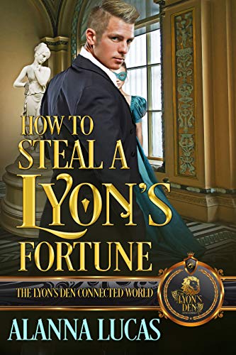
HOW TO STEAL A LYON’S FORTUNE
When it comes to stealing a Lyon's fortune, it takes two to right a wrong.
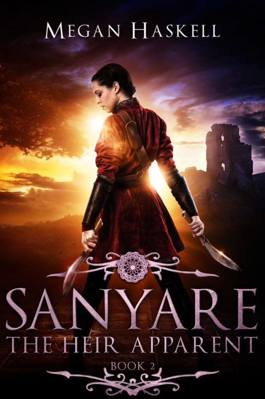
More info →SANYARE: THE HEIR APPARENT
Her secret is unraveling. One dangerous quest could end it all...
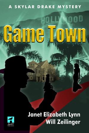
More info →GAME TOWN
Follow Skylar Drake to Hollywood parties where the forbidden is accepted and games played are for keeps.
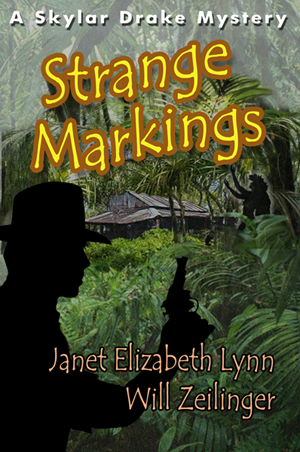
More info →STRANGE MARKINGS
The Pacific breezes blow many things in from the ocean, this time its power, greed, and murder.
More info →Newsletter
Contributing Authors
Search A Slice of Orange
Find a Column
Archives
Authors in the Bookstore
- A. E. Decker
- A. J. Scudiere
- A.J. Sidransky
- A.M. Roark
- Abby Collette
- Alanna Lucus
- Albert Marrin
- Alice Duncan
- Alina K. Field
- Alison Green Myers
- Andi Lawrencovna
- Andrew C Raiford
- Angela Pryce
- Aviva Vaughn
- Barbara Ankrum
- Bethlehem Writers Group, LLC
- Carol L. Wright
- Celeste Barclay
- Christina Alexandra
- Christopher D. Ochs
- Claire Davon
- Claire Naden
- Courtnee Turner Hoyle
- Courtney Annicchiarico
- D. Lieber
- Daniel V. Meier Jr.
- Debra Dixon
- Debra H. Goldstein
- Debra Holland
- Dee Ann Palmer
- Denise M. Colby
- Diane Benefiel
- Diane Sismour
- Dianna Sinovic
- DT Krippene
- E.B. Dawson
- Emilie Dallaire
- Emily Brightwell
- Emily PW Murphy
- Fae Rowen
- Faith L. Justice
- Frances Amati
- Geralyn Corcillo
- Glynnis Campbell
- Greg Jolley
- H. O. Charles
- Jaclyn Roché
- Jacqueline Diamond
- Janet Lynn and Will Zeilinger
- Jaya Mehta
- Jeannine Atkins
- Jeff Baird
- Jenna Barwin
- Jenne Kern
- Jennifer D. Bokal
- Jennifer Lyon
- Jerome W. McFadden
- Jill Piscitello
- Jina Bacarr
- Jo A. Hiestand
- Jodi Bogert
- Jolina Petersheim
- Jonathan Maberry
- Joy Allyson
- Judy Duarte
- Justin Murphy
- Justine Davis
- Kat Martin
- Kidd Wadsworth
- Kitty Bucholtz
- Kristy Tate
- Larry Deibert
- Larry Hamilton
- Laura Drake
- Laurie Stevens
- Leslie Knowles
- Li-Ying Lundquist
- Linda Carroll-Bradd
- Linda Lappin
- Linda McLaughlin
- Linda O. Johnston
- Lisa Preston
- Lolo Paige
- Loran Holt
- Lynette M. Burrows
- Lyssa Kay Adams
- Madeline Ash
- Margarita Engle
- Marguerite Quantaine
- Marianne H. Donley
- Mary Castillo
- Maureen Klovers
- Megan Haskell
- Melanie Waterbury
- Melisa Rivero
- Melissa Chambers
- Melodie Winawer
- Meriam Wilhelm
- Mikel J. Wilson
- Mindy Neff
- Monica McCabe
- Nancy Brashear
- Neetu Malik
- Nikki Prince
- Once Upon Anthologies
- Paula Gail Benson
- Penny Reid
- Peter J Barbour
- Priscilla Oliveras
- R. H. Kohno
- Rachel Hailey
- Ralph Hieb
- Ramcy Diek
- Ransom Stephens
- Rebecca Forster
- Renae Wrich
- Roxy Matthews
- Ryder Hunte Clancy
- Sally Paradysz
- Sheila Colón-Bagley
- Simone de Muñoz
- Sophie Barnes
- Susan Kaye Quinn
- Susan Lynn Meyer
- Susan Squires
- T. D. Fox
- Tara C. Allred
- Tara Lain
- Tari Lynn Jewett
- Terri Osburn
- Tracy Reed
- Vera Jane Cook
- Vicki Crum
- Writing Something Romantic
Affiliate Links
A Slice of Orange is an affiliate with some of the booksellers listed on this website, including Barnes & Nobel, Books A Million, iBooks, Kobo, and Smashwords. This means A Slice of Orange may earn a small advertising fee from sales made through the links used on this website. There are reminders of these affiliate links on the pages for individual books.
