emaginings: Random Musings @LyndiLamont
August 26, 2013 by Linda McLaughlin in category The Romance Journey by Linda Mclaughlin tagged as Buffer app, cover art, emaginings, Facebook, Lyndi Lamont, Social Media, Twitter hashtagsThis has been the month from I-don’t-know-where. I missed my regular blog date of the 16th, due to not having any wi-fi. Long story that culminated with having to return our 7-week-old iPad 4 and pick up a new one. Thankfully, the new one works fine (so far) but it threw me completely off schedule.
The rights to a bunch of my short stories reverted this summer and I’m struggling to get them revised and reissued, not anywhere as quickly as I’d like while also writing new material. I feel like a juggler with two many balls in the air.
I’m also continuing my forays into various social networking sites. I joined Facebook this year, finally, thanks to Debra Holland. So now I have a personal profile and two pages, one for Linda and one for Lyndi. Facebook has been more fun than I anticipated, for the most part, and not as absorbing as I feared.OCC member, Lex Valentine of Winterheart Design, created two really pretty page covers for me. She’s so talented. Lex also created the cover for my upcoming re-release, Marooned, currently on sale at Smashwords, but coming soon to Amazon & other retailers. She said hopefully.
Apparently, I’ve also managed to accidentally activate a Google+ account for Lyndi, by clicking on something in my gmail account that I didn’t intend to click. I feel like such an idiot some time. Maybe I’ll have that one somewhat figured out by next month’s blog. Pretty sure I am going to delete my Pinterest account since I never use it and can’t afford to spare the broadband such a graphics intense site requires.
Still using Buffer app to schedule tweets and now Facebook shares and liking it more and more. You can now custom schedule a message to go out a day or more in advance, which really helps with planning. Using their analytics also clued me in to the fact that adding the hashtag #Author to a tweet really ups the potential for viewing from my app. 790 followers to several thousand possibilities. Potentially useful information.
Feel free to share any useful social media tips in the comments section. I can use all the help I can get!
Linda/Lyndi
Linda McLaughlin / Lyndi Lamont
Websites: http://www.lindamclaughlin.com
http://www.lyndilamont.com
Blogs:
Flights of Fancy
Lyndi’s Love Notes
Facebook
Twitter
Between the Red-Hot Covers by Jina Bacarr
June 11, 2013 by A Slice of Orange in category Archives tagged as Amazon Kindle, Cosmo, cover art, erotic romance, espionage, Harlequin, naked, Red-Hot Reads, spy, sushiWe’ve seen it all over the years in book covers.
Cute cartoon covers, clinch covers, and the recent addition of “elegant bling” covers. Masks, cufflinks, a man’s tie–you know what I mean.
Now I’m excited about a new trend: Temp covers!
For the first time since I’ve published, Harlequin has put up “temp” covers for the Cosmo Red-Hot Reads.
Each of the books that I’ve found on Amazon by Lauren Dane, Tawny Weber, and Helen Kay Dimon all show the same wildly sexy, raspberry-red covers with the Cosmo logo.
Here’s the RED-HOT Temp Cover for my Cosmo Red Hot-Read: NAKED SUSHI!!
Amateur spy PEPPER O’MALLEY gets more than she bargained for when she discovers her sleazy boss is hiding corporate secrets.
She gets fired.
Was it her fault she got caught in the copy room with her pants down with a hunky thief?
The only way Pepper can get her job back is to become a naked sushi model and spy on her ex-boss.
She’s thrown into a world of corporate espionage she never imagined…
What do you think of the idea of Temp Covers? It’s definitely branding the books in a unique and exciting way. I can only imagine the sexy cover Harlequin has up their sleeve for Naked Sushi…
Cover Art Compromise
July 13, 2012 by A Slice of Orange in category Archives tagged as cover art, Lex Valentine, Winterheart DesignI’ve been having issues lately with some of the authors I’m doing covers for. The publisher’s new cover art form doesn’t really tell me what the characters look like. What the publisher is striving for is a new level of communication between the artist and the author. Thus far, I’m not sure if this way of doing things is working or not. I’m at the 50% mark. Half of the covers I’ve worked on have been simple because of this change in the process. The other half have been far more difficult.
Usually, for cover artists that actually do communicate with the author (remember that some houses do not allow this and some houses do not allow the author to have any input on the cover at all either) you can discover pretty quickly who is a diva with an entitled attitude and who isn’t. I’m not sure why, but I am still shocked when a brand new author exhibits this kind of attitude. I was pretty humble when I got my first contract. I was grateful for the things the publisher and cover artist could teach me about the process. I was grateful to have input at all.
When a brand new author comes at me with an aggressive attitude, requesting (okay demanding) to have her vision of the cover and to hell with what’s possible and what’s not possible…well, I tend not to give that person my best work because I’ve shifted into auto-pilot. I put together a cover that gives the author what they want without any creative input from me. The result can be a cover I wish I didn’t have my name on even if the author loves it. I know from experience though that trying to put my artistic stamp on a cover when an author isn’t willing to listen is a waste of time. I always want to tell them, “Look, there’s a reason you’re the author and I’m the artist. Believe me, your vision of this cover isn’t an attractive one!” Of course, I bite my tongue because that’s not professional. And, of course, like anyone who is frustrated I can have those moments where I think that maybe karma will win out and people won’t be attracted to the ugly cover the author likes so much, thereby losing them sales. Yes, I have my mean moments too. Born of frustration usually. Doesn’t mean I act on those moments and it doesn’t mean I continue to feel that way past the silent mental expression of it inside my own head. Luckily, this isn’t the norm.
This week I had a brand new author who had the best attitude ever. The cover I made was for her very first book. She had filled out one of the old cover art forms (not one of the new ones that make me have to grill the author about their characters before I can even start) and described a place in the book and the couple. She did a nice job with her descriptions and I came up with what I thought was a beautiful cover. She thought so too. She loved it. And many of you know how good it felt when the cover of your first book turned out to be gorgeous. It lifted you up, didn’t it? Made you feel even better about that first contract…
I ended up having a conversation with this author after everything was finalized. She thought looking for images must be hard work. I told her,it’s not looking for images that’s hard. It’s pleasing authors who have a vision in their head that they aren’t willing to bend on and who have no clue that what they are asking for is impossible. I told her, “And the things they think you should be able to do with a photograph in order to make it what they want…sheesh. Change the hair, change the eye color, put more clothes, less clothes, can he have his arm around her, make her expression not so soft, he needs to look at her more, needs thinner lips, more muscles, less hair, blah blah blah… Some stuff is possible, other things just are not and they don’t get it when you tell them that.”
It’s not always easy to be a cover artist, that’s for sure! And my author side had to remember this when filling out my own cover art form for Loose Id this week. I took my time with the form because this book is special to me and I wanted the artist to have a sense of that. It would kill me to have a cover that didn’t show the reader just how special Scrambling is. So I filled out my form very carefully in the hope that the art director and artist can see what this cover needs to be and what will make me happy as a new author with this house.
So just remember in the future with whatever publisher or artist you have to work with, be specific in the sense that you need them to know what your character looks like not just physically but emotionally. Be willing to bend on some of those specifics that you know are so unique to your character that a stock image probably won’t have it. And be willing to give the artist in words on your art form enough information to give the reader a sense of your book and your main characters. You want the cover to entice a reader to buy it so keep that in the back of your head when you fill out an art form. As long as you’re not a diva, you’ll be just fine and artists will be happy to work with you and will strive to give you their best work.
Lex Valentine
Winterheart Design
2011 EPIC Ariana Award Winning Cover Artist
winterheart.com
Cover Art Corner
April 14, 2012 by A Slice of Orange in category Archives tagged as cover art, Lex Valentine Today, I’m starting a quarterly series on cover art. I’ll be asking for people to send me questions which I will answer in future posts. To start out, I’ll give you all some information on who I am and who I do covers for.
For those of you who don’t know me, I write under the pen name Lex Valentine, but before there was a Lex there was a Winter. Winter’s been around on the internet since the early 90’s. That’s when a friend got her the domain name winterheart.com. (Yes, I really have had the domain for more than 15 years!) Winter has also been messing around with websites and photo manipulation for about that long although not in any real serious way.
So, now we’ve established that I go by both Lex and Winter and that I’ve had winterheart.com a long time, I want to roll the calendar forward to 2006 or so. I started writing in a serial story online and we gathered photos of celebs to depict our characters. I ended up making banners and avatars for the characters and learned to swap heads on photos. (Guess whose head was swapped on that image of “Al & Lex”, two characters from the serial story?) This is really where I started learning Photoshop. I took a couple of classes that the company I worked for paid for, but really, what I learned was all trial, lots of error, and some video tutorial watching on YouTube.
When I was first published, my publisher at Pink Petal Books was ecstatic to learn I knew Photoshop and I started doing covers for her, including all my own covers. Over the years since then I’ve started doing covers for MLR Press and it’s imprints Passion in Print and Featherweight Press. I’ve also recently begun doing covers for MuseItUp too.
 Last year one of my covers for Pink Petal Books won an EPIC ARIANA Award for best erotic contemporary cover. Competition is fierce in the ARIANAs and I was honored to win one. I’ve had numerous covers final but there is nothing like winning!
Currently, I do a lot of work for authors who are self-publishing the books they get their rights back to. A couple of weekends back, I did a total of 13 covers! Well, it did include two series with similar covers but it was still a lot of work.
At any rate, what I do involves a lot of communication with the author. I use the information I get about the book to come up with a cover that is visually appealing while still conveying something of the story inside. This isn’t always easy to do. Some authors have a very clear vision in their head of what their cover should look like, regardless of whether they have an artistic eye or not. They want what they want. I try to give authors what they want whether I think it’s appealing or not because the most gorgeous cover that I think will sell lots of books may not be at all what the author wants for his/her book. And if the author isn’t happy with it, no matter how beautiful it is, they will treat it like it’s ugly and unhappy authors don’t say complimentary things about cover artists.
I really like it when the author gives me a sense of the book without telling me what to put on the cover. I like a little freedom to create something I think will appeal to those who look at it. It’s a tough line to walk though and authors can be all over the charts in terms of how easy or difficult they are to work with.
In the end, what I really want is for the cover to sell books. I want the author and publisher to be so happy with sales that they are happy to work with me again.
I’m going to close today with a slideshow of covers I’ve made. I want you all to look at them and think about them and what makes them appealing or not appealing to you. And then I want you to comment on this post or email me with questions or comments about the covers and what you liked or didn’t like and why. I’m going to take all those comments and use them to tailor my next post about cover art.
12 0 Read moreAffiliate Links
A Slice of Orange is an affiliate with some of the booksellers listed on this website, including Barnes & Nobel, Books A Million, iBooks, Kobo, and Smashwords. This means A Slice of Orange may earn a small advertising fee from sales made through the links used on this website. There are reminders of these affiliate links on the pages for individual books.
Search A Slice of Orange
Find a Column
Archives
Featured Books
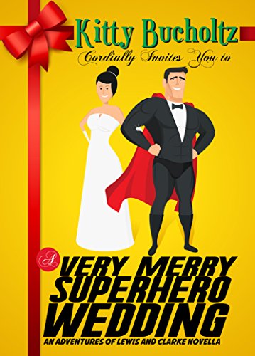
A VERY MERRY SUPERHERO WEDDING
Wedding Dreams . . . and Christmas Fiends
More info →LOVE NOTES
Love isn't a one note emotion...it's a symphony with a sweet melody.
More info →Newsletter
Contributing Authors
Search A Slice of Orange
Find a Column
Archives
Authors in the Bookstore
- A. E. Decker
- A. J. Scudiere
- A.J. Sidransky
- A.M. Roark
- Abby Collette
- Alanna Lucus
- Albert Marrin
- Alice Duncan
- Alina K. Field
- Alison Green Myers
- Andi Lawrencovna
- Andrew C Raiford
- Angela Pryce
- Aviva Vaughn
- Barbara Ankrum
- Bethlehem Writers Group, LLC
- Carol L. Wright
- Celeste Barclay
- Christina Alexandra
- Christopher D. Ochs
- Claire Davon
- Claire Naden
- Courtnee Turner Hoyle
- Courtney Annicchiarico
- D. Lieber
- Daniel V. Meier Jr.
- Debra Dixon
- Debra H. Goldstein
- Debra Holland
- Dee Ann Palmer
- Denise M. Colby
- Diane Benefiel
- Diane Sismour
- Dianna Sinovic
- DT Krippene
- E.B. Dawson
- Emilie Dallaire
- Emily Brightwell
- Emily PW Murphy
- Fae Rowen
- Faith L. Justice
- Frances Amati
- Geralyn Corcillo
- Glynnis Campbell
- Greg Jolley
- H. O. Charles
- Jaclyn Roché
- Jacqueline Diamond
- Janet Lynn and Will Zeilinger
- Jaya Mehta
- Jeannine Atkins
- Jeff Baird
- Jenna Barwin
- Jenne Kern
- Jennifer D. Bokal
- Jennifer Lyon
- Jerome W. McFadden
- Jill Piscitello
- Jina Bacarr
- Jo A. Hiestand
- Jodi Bogert
- Jolina Petersheim
- Jonathan Maberry
- Joy Allyson
- Judy Duarte
- Justin Murphy
- Justine Davis
- Kat Martin
- Kidd Wadsworth
- Kitty Bucholtz
- Kristy Tate
- Larry Deibert
- Larry Hamilton
- Laura Drake
- Laurie Stevens
- Leslie Knowles
- Li-Ying Lundquist
- Linda Carroll-Bradd
- Linda Lappin
- Linda McLaughlin
- Linda O. Johnston
- Lisa Preston
- Lolo Paige
- Loran Holt
- Lynette M. Burrows
- Lyssa Kay Adams
- Madeline Ash
- Margarita Engle
- Marguerite Quantaine
- Marianne H. Donley
- Mary Castillo
- Maureen Klovers
- Megan Haskell
- Melanie Waterbury
- Melisa Rivero
- Melissa Chambers
- Melodie Winawer
- Meriam Wilhelm
- Mikel J. Wilson
- Mindy Neff
- Monica McCabe
- Nancy Brashear
- Neetu Malik
- Nikki Prince
- Once Upon Anthologies
- Paula Gail Benson
- Penny Reid
- Peter J Barbour
- Priscilla Oliveras
- R. H. Kohno
- Rachel Hailey
- Ralph Hieb
- Ramcy Diek
- Ransom Stephens
- Rebecca Forster
- Renae Wrich
- Roxy Matthews
- Ryder Hunte Clancy
- Sally Paradysz
- Sheila Colón-Bagley
- Simone de Muñoz
- Sophie Barnes
- Susan Kaye Quinn
- Susan Lynn Meyer
- Susan Squires
- T. D. Fox
- Tara C. Allred
- Tara Lain
- Tari Lynn Jewett
- Terri Osburn
- Tracy Reed
- Vera Jane Cook
- Vicki Crum
- Writing Something Romantic
Affiliate Links
A Slice of Orange is an affiliate with some of the booksellers listed on this website, including Barnes & Nobel, Books A Million, iBooks, Kobo, and Smashwords. This means A Slice of Orange may earn a small advertising fee from sales made through the links used on this website. There are reminders of these affiliate links on the pages for individual books.
