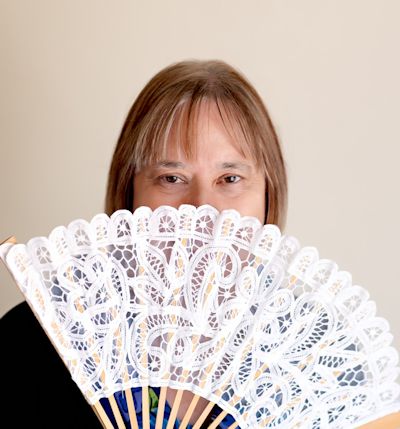
Kitty Bucholtz, March Featured Author
March 14, 2023 by Kitty Bucholtz in category Featured Author of the Month tagged as Featured author, Kitty Bucholtz, romantic comedy, Superheros, Write Now Workshop Podcast

March featured author Kitty Bucholtz is a writer, podcaster, and a book coach. She has combined her undergraduate degree in business, her years of experience in accounting and finance, and her graduate degree in creative writing to become a writer-turned-independent-publisher turned coach.
She writes romantic comedy and superhero urban fantasy, often with an inspirational element woven in. She loves to teach and offer advice to writers through her WRITE NOW! Workshop Podcast.
Kitty has also created the Finish Your Books Coaching Program. Find out more about either 1:1 Coaching or Group Coaching on Kitty’s website. http://kittybucholtz.com/
Besides Kitty’s Coaching Program and WRITE NOW! Workshop Podcast, you will find her here at A Slice of Orange on the 9th of each month writing It’s Worth It.
Books by Kitty Bucholtz
The 2023 Bethlehem Writers Roundtable Short Story Award
March 13, 2023 by marianne h donley in category Contests, From a Cabin in the Woods by Members of Bethlehem Writers Group, Writing Contest tagged as Barb Goffman, Bethlehem Writers Group, Bethlehem Writers Roundtable Short Story Award, Writing contest
The 2023 Short Story Award is now open for submissions!
The theme: Season’s Readings
Bethlehem Writers Group is seeking never-published short stories of 2,000 words or fewer for a chance to win.
Winners will receive:
First Place:
$250 and publication in our upcoming anthology: Season’s Readings: More Sweet, Funny, and Strange Holiday Tales
Second Place:
$100 and publication in Bethlehem Writers Roundtable
Third Place:
$50 and publication in Bethlehem Writers Roundtable
Click here for submission rules

The 2023 Guest Judge is renowned Short Story Writer and Editor Barb Goffman. You can read an interview with her here.

Other Books Published by BWG
Use Your Own Photos As Background Images In Your Graphics
March 12, 2023 by Denise M. Colby in category The Writing Journey by Denise Colby tagged as background images, Marketing for Authors, Social Media, Visual Content MarketingBackground images in graphics is something we don’t talk about much. Yet, when you see a social media graphic with a great quote, there most always is a graphic behind the words that helps communicate the message. So, if you plan to create your own graphics, choosing the photos you use in those graphics matter.
What to use as a background image
Nature is a popular choice, especially sunsets, sunrises, flowers, mountains or waterfalls. Images with animals are selected frequently as well, showing them all in their cute glory or in varying circumstances that can be funny or memorable. When we look at humorous posts, an image with a funny face or situation lends to the message.

The colors you use in your backgrounds is just as important. Sometimes the photo itself in the background may drive what color you use for your text in order for them to blend. But keep in mind, colors represent different things to people. Look up color choices, if interested in what emotion you want to convey in your graphics. And then choose your background image color accordingly.

I found this definition on the internet about using backgrounds in graphic design.
Backgrounds are the foundation of a successful composition. Background textures and colors create depth and contrast, allowing graphics to stand out and get noticed. Well-composed background images can help create space for you to overlay text.
Incorporating your brand in your background choices
Something to keep in mind is your brand. What is your brand? Specific colors in your brand? Do you have animals in your stories? Or what settings do you write most of your scenes? These all are ideas of what to use as background images in your graphics.
For example, if you write about cowboys, then horses and sunsets might be good options to include in your graphics. Every graphic should include your branding in some way. And think outside of the box a little bit to expand your branding content.
I found some 12 x 12 paper I liked and gave a historical look that I wanted in my background images. As I started using these to take pictures of books, bookmarks and other small items in my graphics, I liked the results.


Out of the few I first bought, I tend to use the same ones over and over because I like how the wood contrasts with all the types of images I’m creating.


If you know your brand and have a look, this is a great way to build consistency in your content. Try some things. It’s the only way to know what works and what doesn’t.
Taking your own photos and using them as background images
It’s important to note to not just find any photo off the internet. That’s actually taking someone else’s intellectual property. Instead you can find photos for free from certain apps, as well as purchase photos from several different resources.
Taking your own photos is a great way to create content. See if you can find things around you to be used as background images.

Start seeing backgrounds in the world around you
Some of this will take practice, but keeping an eye out for what you like is important. You have a brand and your brand is your style. Think about your readers, but I would focus on things that speak to you as well. A look, a vibe. All of which will come out as you build your content in your social media.
Be careful not to include anything people would be able to recognize. That’s not the point of a background image. And you don’t want something on your graphics that is someone else’s brand.
I’ve created a folder on my phone in my photos that is for background images. When I take a picture of something that I think would make a great background I save it in there so I can find it easily.
A little Disney magic in the background
One of my favorite places to find image backgrounds is Disneyland. Everything is clean and colorful and there are lots of choices available, from rock walls, boards, or the pathways. If you look around you can see things that you hadn’t noticed before, but they are part of the atmosphere. That’s what you want for your background photos. Something that blends in nicely but is clean and aestheticly pleasing.


I love going to Disneyland and taking pictures of the things around me. Disney thinks through everything, and it’s given me some great ideas for image backgrounds. Here are some additional examples:


If you zoom in close on something it can provide a completely different perspective and make the perfect background image.
I hope these examples give you some ideas for you to use in your content in the future.
Thanks for reading!
Denise M. Colby loves to write blog posts on marketing and SEO. She also loves to write about her word of the year. She creates social media graphics to highlight quotes from her word of the year. Take a look at this blog post on her 2022 word Work for additional ideas. Or the graphics created for her 2021 word Wisdom using the 12 x 12 paper mentioned above. Check out the new ones she’s created for her 2023 word Change. Or see more on her instagram or facebook pages.
When you’re on deadline and the time changes and you freak out when you lose an hour by Jina Bacarr
March 11, 2023 by Jina Bacarr in category Jina’s Book Chat, Writing tagged as #Historical, clocks forward, editing, Paris, time change, women's fiction, World War 2, writing
when the time changes and you don’t…
If there’s one thing we writers never have enough of…
It’s time.
Words we got… thousands.
Coffee… by the potful.
Comfy bunny slippers… on automatic re-order from Amazon.
But time?
That’s as elusive as the instant bestseller.
I’m on autopilot this week until whenever to get it all together and bring my next Paris WW2 novel home for my publisher Boldwood Books. Amazing company. They take good care of their authors… fabulous marketing team… I love my editor, Isobel… and the company has won several ‘Best Publisher’ awards in the UK and is up for more awards this year.
And my fellow authors are like family to me.
But in the end, it’s up to me to write the damn book.
Sweat, tears… blood. Yes, I changed the order because I sweat the small stuff like commas and the big stuff like research which turns into major tears when I realize writing never gets easier but tougher (you demand more of yourself)… and blood because if you don’t bleed onto the page, you’re not giving it your all.
So, mes amis, tonight is the night we turn the clocks forward and lose the hour.
But guess what. I’ve decided to do something about it.
I’m going to type twice as fast for a solid hour (accuracy is another story) and write twice as many words and–
Voilà!
I’ve got my hour back… at least for tonight.
Tomorrow?
Well, that’s another day.
===============
Some great book news:
The trade paperback of my Paris WW2 novel THE LOST GIRL OF PARIS
is coming to THE WORKS stores in the UK… so check it out if you’re in the United Kingdom.
Listen to an excerpt in the video below…
E-book:
My heroine, Angeline de Cadieux, is a Roma girl in WW2 Paris… she’s strong, fights in the Resistance… makes exquisite perfumes and comes up with an amazing marketing campaign during the war to boost morale in France.
Thank you!
————–
And THE RUNAWAY GIRL is a Kindle Monthly Deal in Australia.
Thanks for listening… and now back to our regularly scheduled craziness.
Jina
****Free Book Alert Kissing Galileo is Free for a Short Time ****
March 10, 2023 by marianne h donley in category Spotlight tagged as College Romance, Free Book, kissing galileo, New Adult Romance, Penny Reid, student teacher trope
Kissing Galileo, a standalone friends-to-lovers romantic comedy from New York Times bestselling author Penny Reid, is ZERO PENNIES for just a short while on Amazon. Have you checked out Penny’s Dear Professor series? Now is the perfect time!
★★Grab your copy TODAY!★★
Amazon US: https://amzn.to/36Xj4pZ
Amazon UK: https://amzn.to/38xpr3F
Amazon CA: https://amzn.to/38BOum7
Amazon AU: https://amzn.to/2TUTpdG
Goodreads: http://bit.ly/38A4y7W
★★Blurb★★

What do you do when your freakishly smart and wickedly sarcastic Research Methods professor sees you mostly naked? You befriend him, of course.
‘Kissing Galileo’ is the second book in the Dear Professor series, is 70k words, and can be read as a standalone.
Affiliate Links
A Slice of Orange is an affiliate with some of the booksellers listed on this website, including Barnes & Nobel, Books A Million, iBooks, Kobo, and Smashwords. This means A Slice of Orange may earn a small advertising fee from sales made through the links used on this website. There are reminders of these affiliate links on the pages for individual books.
Search A Slice of Orange
Find a Column
Archives
Featured Books
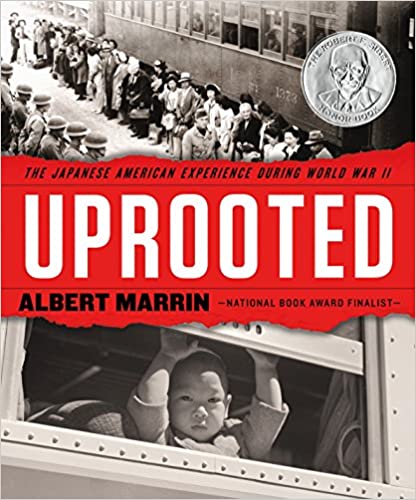
UPROOTED: THE JAPANESE AMERICAN EXPERIENCE DURING WORLD WAR II
A Publishers Weekly Best Book of the Year, A Booklist Editor's Choice
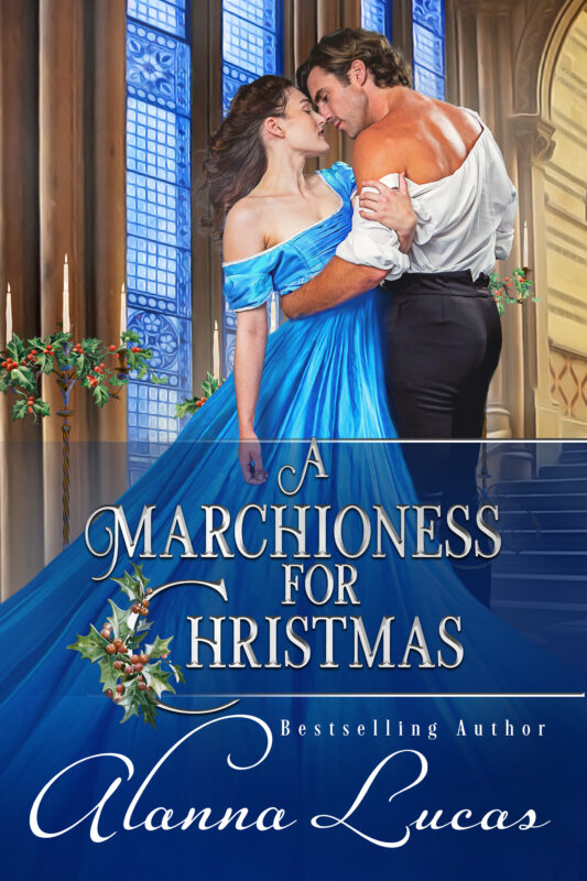
More info →A MARCHIONESS FOR CHRISTMAS
Will Antonia be forced to endure yet another bleak midwinter?
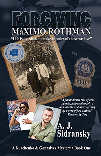
More info →FORGIVING MAXIMO ROTHMAN
Life is too short to make enemies of those we love.
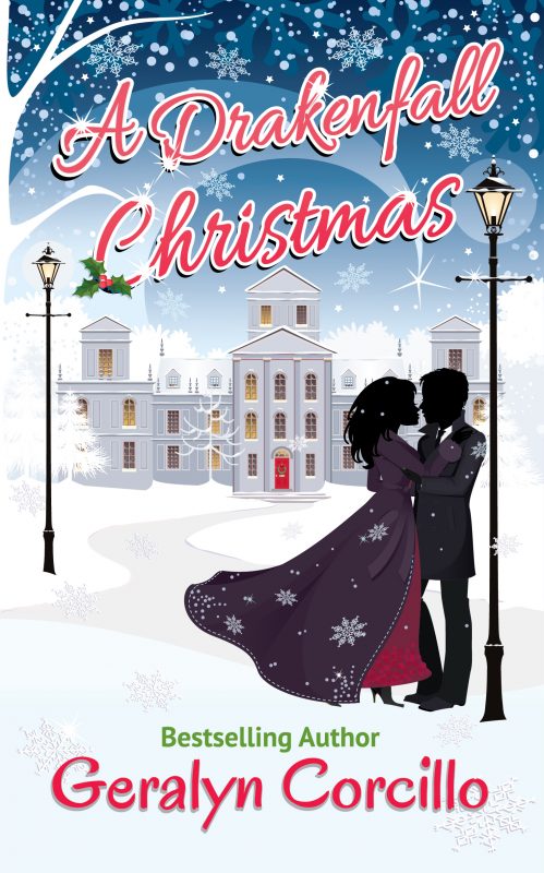
More info →A DRAKENFALL CHRISTMAS
At the English country estate Drakenfall, Christmas is topsy-turvy, romantic, and heartwarming!
More info →Newsletter
Contributing Authors
Search A Slice of Orange
Find a Column
Archives
Authors in the Bookstore
- A. E. Decker
- A. J. Scudiere
- A.J. Sidransky
- Abby Collette
- Alanna Lucus
- Albert Marrin
- Alice Duncan
- Alina K. Field
- Alison Green Myers
- Andi Lawrencovna
- Andrew C Raiford
- Angela Pryce
- Aviva Vaughn
- Barbara Ankrum
- Bethlehem Writers Group, LLC
- Carol L. Wright
- Celeste Barclay
- Christina Alexandra
- Christopher D. Ochs
- Claire Davon
- Claire Naden
- Courtnee Turner Hoyle
- Courtney Annicchiarico
- D. Lieber
- Daniel V. Meier Jr.
- Debra Dixon
- Debra H. Goldstein
- Debra Holland
- Dee Ann Palmer
- Denise M. Colby
- Diane Benefiel
- Diane Sismour
- Dianna Sinovic
- DT Krippene
- E.B. Dawson
- Emilie Dallaire
- Emily Brightwell
- Emily PW Murphy
- Fae Rowen
- Faith L. Justice
- Frances Amati
- Geralyn Corcillo
- Glynnis Campbell
- Greg Jolley
- H. O. Charles
- Jaclyn Roché
- Jacqueline Diamond
- Janet Lynn and Will Zeilinger
- Jeff Baird
- Jenna Barwin
- Jenne Kern
- Jennifer D. Bokal
- Jennifer Lyon
- Jerome W. McFadden
- Jill Piscitello
- Jina Bacarr
- Jo A. Hiestand
- Jodi Bogert
- Jolina Petersheim
- Jonathan Maberry
- Joy Allyson
- Judy Duarte
- Justin Murphy
- Justine Davis
- Kat Martin
- Kidd Wadsworth
- Kitty Bucholtz
- Kristy Tate
- Larry Deibert
- Larry Hamilton
- Laura Drake
- Laurie Stevens
- Leslie Knowles
- Li-Ying Lundquist
- Linda Carroll-Bradd
- Linda Lappin
- Linda McLaughlin
- Linda O. Johnston
- Lisa Preston
- Lolo Paige
- Loran Holt
- Lyssa Kay Adams
- Madeline Ash
- Margarita Engle
- Marguerite Quantaine
- Marianne H. Donley
- Mary Castillo
- Maureen Klovers
- Megan Haskell
- Melanie Waterbury
- Melisa Rivero
- Melissa Chambers
- Melodie Winawer
- Meriam Wilhelm
- Mikel J. Wilson
- Mindy Neff
- Monica McCabe
- Nancy Brashear
- Neetu Malik
- Nikki Prince
- Once Upon Anthologies
- Paula Gail Benson
- Penny Reid
- Peter Barbour
- Priscilla Oliveras
- R. H. Kohno
- Rachel Hailey
- Ralph Hieb
- Ramcy Diek
- Ransom Stephens
- Rebecca Forster
- Renae Wrich
- Roxy Matthews
- Ryder Hunte Clancy
- Sally Paradysz
- Sheila Colón-Bagley
- Simone de Muñoz
- Sophie Barnes
- Susan Lynn Meyer
- Susan Squires
- T. D. Fox
- Tara C. Allred
- Tara Lain
- Tari Lynn Jewett
- Terri Osburn
- Tracy Reed
- Vera Jane Cook
- Vicki Crum
- Writing Something Romantic
Affiliate Links
A Slice of Orange is an affiliate with some of the booksellers listed on this website, including Barnes & Nobel, Books A Million, iBooks, Kobo, and Smashwords. This means A Slice of Orange may earn a small advertising fee from sales made through the links used on this website. There are reminders of these affiliate links on the pages for individual books.
