Pitfalls of Research: Too Much vs. Too Little by @LyndiLamont
May 16, 2017 by Linda McLaughlin in category The Romance Journey by Linda Mclaughlin tagged as Linda McLaughlin, Regency romance, research, societyRecently I listened to a perfectly delightful Regency romance on audio, but some obvious errors nagged at me and got me to pondering which is worse, too much research or too little?
 Those of us who write books that require extensive research are always advised to not let the research show. Weave it as seamlessly as possible into the narrative. That makes perfect sense, though it isn’t easy to do. But what about too little research? That’s when errors become glaring enough that some readers, esp. the ones who also write, are pulled out of the story, saying “Wait a minute, that’s not right.”
Sometimes it’s a matter of historical characters acting or speaking in modern fashion. This can be one of the most glaring problems. Then there is the matter of social mores of the time, which vary from one period to the next.
One of the biggest traps novelists can fall into is writing historical characters with 21st century mores. And nothing can make the reader want to throw a book across the room quicker. This especially applies to women. The double standard still exists, but it was much greater in previous centuries. A young woman’s reputation was golden.
War and social unrest have always upset the normal patterns of life, and social mores tend to fall by the wayside during such periods. Still, a historical female character who shows no regard for her reputation isn’t believable unless she’s already a fallen woman and has no reputation to lose.
 Personally, I don’t necessarily mind a heroine who flaunts society’s rules; I just need to believe that she knows what she is doing and is well motivated in her choices. The woman who doesn’t understand the consequences of her actions strains credibility. Women had a lot more to lose in the not-so-good old days.
In the book in question, the problem seemed to be more one of the author not understanding how the social season worked. Societal rules were much more stringent, esp. among the upper classes. It was one way the maintained their air of privilege. It all seems ridiculous to us now, but the aristocracy took these things very seriously.
 In general, a young lady could not be out in society unless she had been presented at court and made her bow to the Queen. In my Regency romance, Lady Elinor’s Escape, Lady Elinor is hiding out in a dress shop, pretending to be a seamstress, which means she could not also be out in society. But we writers find ways around details like that. The one ball scene in the book is a masquerade ball she attends only because the shop owner retrieved a discarded invitation from the trash. As long as Elinor leaves before the unmasking at midnight, she feels the risk is worth it.
In writing, like Regency society, it’s best to know the rules before you (or your characters) break them.
So too much research or too little? I’m enough of a history freak to prefer too much research showing to wondering if the author did any at all. What do you think?
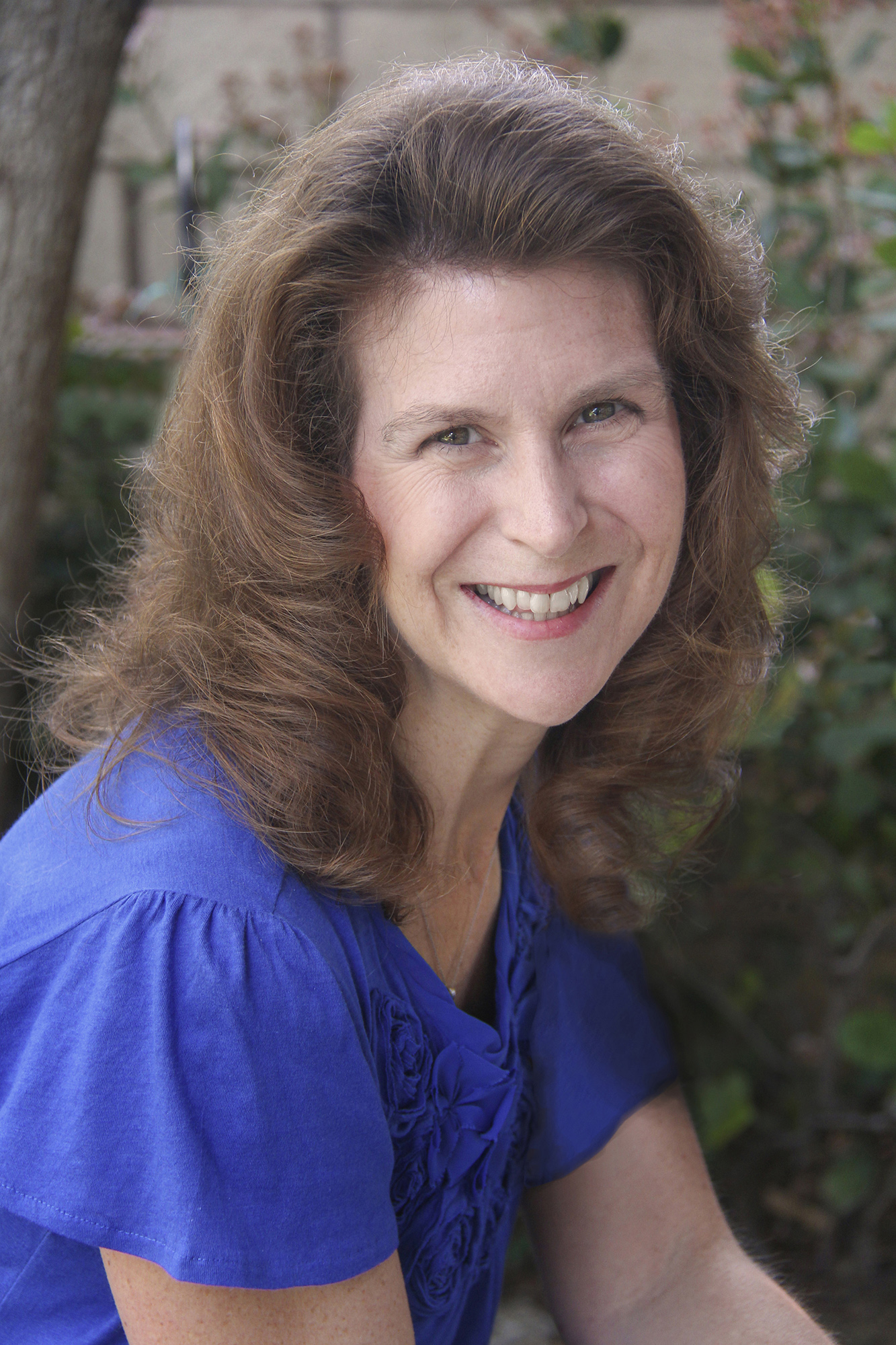
Linda McLaughlin
aka Lyndi Lamont
http://lindalyndi.com
SEW UP A BOOK
May 15, 2017 by Rebecca Forster in category The Write Life by Rebecca Forster, Writing tagged as Rebecca Forster, thrillers, writingYears ago, I worked in corporate America and my client was married to Danielle Steel. When I found out who she was, I uttered seven ridiculous words: “I bet I could write a book.”
One of my colleagues called me on that boast and that’s how I became a writer – on a crazy dare. Having never written before, I tackled this challenge in the same way I tackled a marketing plan: by asking questions about how I would go about becoming a published author. In the old days, all I had to do was write a pitch and hope someone paid attention; these days all I have to know is how to upload to Amazon. But the business of publishing begged the question that was most important: how do I learn to actually write a book?
I decided I would learn the same way I learned to sew; I would follow a pattern.
With one of Danielle Steel’s books in hand, I spent three nights with that book, a glass of wine and a yellow marker. As I read, I highlighted the ‘seams’ of her work. My pattern consisted of noting:
- When the main characters were introduced
- Where the plot points happened
- Where the emotional reveals came in
- How many pages of expository were in her book
- How long were the dialogue passages
- How many total pages were in the book
I wrote for months and when I was done I had exactly the right number of pages, all the characters came in on cue, and the plot was revealed appropriately. What a yawn.
My book was the equivalent of making a shift dress out of burlap. It was technically correct but plain and unexciting. My book had nothing to make it memorable to a reader. I didn’t want to just go to the published-author party; I wanted readers’ heads to turn. I needed to learn what sets an artist apart from a painter, a fashion designer from a seamstress and a writer from an author. Bottom line: I needed some buttons and bows, some satin and lace. I needed some style.
I am writing my thirty-fifth book and I have learned a great deal, but I still follow the pattern I created years ago. I have grown as an author, found my voice, honed my observations and come to understand my personal style. I hope that someday a writer will take a yellow marker to one of my books and make a pattern of her own from my work. Then I hope she will be inspired to kick it all up a notch with her buttons and bows.
Rebecca

Subscribe and get my 2-book starter library FREE:
Follow me on Bookbub!
Follow me on Facebook
Follow me on Twitter
Summer Adventure
May 14, 2017 by A Slice of Orange in category Guest Posts, Spotlight, Writing tagged as Adventures, Kat Martin, romantic suspense, Summer Please welcome best-selling author, Kat Martin, to A Slice of Orange
Kat is a graduate of the University of California at Santa Barbara where she majored in Anthropology and also studied History. Currently residing with her Western-author husband, L. J. Martin, in Missoula, Montana, Kat has written sixty eight Historical and Contemporary Romantic Suspense novels. More than sixteen million copies of her books are in print and she has been published in twenty foreign countries. Her last novel, INTO THE FIRESTORM, took the #7 spot on the New York Times Bestseller list. This will be the 15th novel in a row to be included on that prestigious list. Kat is currently at work on her next Romantic Suspense.
Make sure you read about Kat’s special May contest. You will find more information after her blog post.

Summer Adventure
Every summer my husband and I try to have some kind of adventure. Not the hearty kind we used to undertake–like riding horseback into the high Sierras or tent camping for a week in Montana. But whatever we choose, summer is great time for a getaway.
This year, we’re driving from our home in Montana to the Western Writers of America conference in Kansas City, Missouri. We’ll take the back roads, meander two-lane highways that wind through six different states.
Along the way we hope to visit old writer friends, Kathleen and Michael Gear–authors of the PEOPLE series that takes place 10,000 years ago. They live on a buffalo ranch in Wyoming.
From there, we’ll head for the Dakotas, spend a little time in Rapid City, a great old West town. Lots of historic buildings and fun art galleries.
Staying off the beaten path, you can find all sorts of intriguing bits of history. Sioux City sits right on the Missouri, plenty of steamboat lore, and you can learn about Louis and Clark in Omaha. If you’ve never done a cross country road trip, it’s really a worthwhile adventure.
Speaking of highway adventures, BEYOND REASON travels the roadways of Texas. It’s the story of Carly Drake, a young woman who inherits her grandfather’s trucking firm and all the problem that go with it–including murder.
Carly’s biggest problem, however, turns out to be six foot-five-inches of solid male muscle–handsome, mega-rich, powerful and controlling, Lincoln Cain.
It’s high action all the way and of course plenty of hot romance. I hope you’ll watch for BEYOND REASON and that you enjoy it.
So…what’s your favorite adventure? Love to hear about it. Have a great summer and happy reading!
Kat
BEYOND REASON
She’s determined to be successful—no matter who tries to stop her.
More info →WEBSITE: http://www.katmartin.com/
VIDEO LINK: https://www.youtube.com/watch?v=y7eAZvxU-VM
SOCIAL MEDIA
Twitter: https://twitter.com/katmartinauthor
Facebook: https://www.facebook.com/KatMartinAuthor
Contests Contests Contests
SPECIAL CONTEST: http://www.katmartin.com/beyond-reason-giveaway/
To CELEBRATE the release of BEYOND REASON, enter Kat’s new contest for a chance to win a KINDLE FIRE 7″ Display, Wi-Fi, 8 GB and a Kindle copy of AGAINST THE WILD, AGAINST THE SKY and AGAINST THE TIDE. Contest runs from May 1, 2017 through June 30, 2017.
MAY CONTEST: http://www.katmartin.com/monthly-contest/
For May, Kat Martin is giving away to FIVE winners an audio edition of one of her AGAINST series books, plus a copy of INTO THE FIRESTORM.
Spring’s Finest
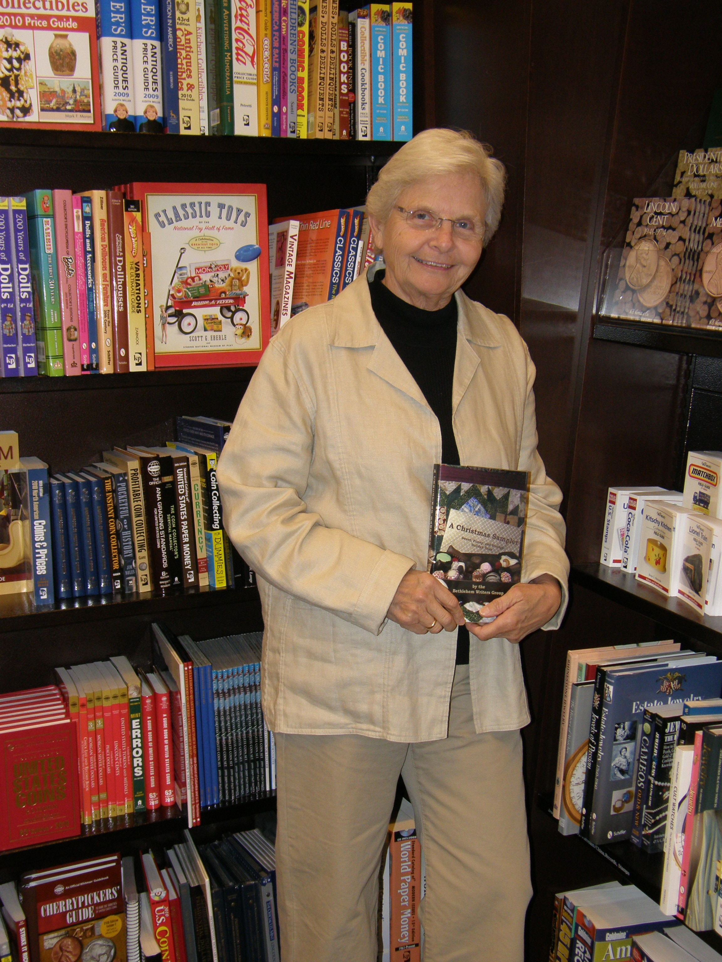
May 13, 2017 by Sally Paradysz in category From a Cabin in the Woods by Members of Bethlehem Writers Group, Writing tagged as kindness, life, Sally Paradysz, SpringThe Taste of Spring


When I was young, I lived in western Massachusetts. To earn money for a new bike, I picked blueberries at the large blueberry farm in our town. The owner, Blueberry Joe!, let me pick every day that I could get there as it was miles away, and it became something wonderful for me in those years before I turned sixteen and could get a real job. It took a very long time until I could make enough money for my bike, but the fault was mine as I ate more berries than I picked for sale.
I think the love of all berries, but especially blueberries, has stayed with me all these years. I have bushes of my own now in the field, and it is yet another one of the miracles of nature for me. We are having many bees pollinating this year, so the crop should be a good one. My uncle had bee hives in his back yard so I was able to watch the process of beekeeping and the honey that I still love.
As a child, I loved listening to the bees, and watching them fly free. At times, they were not even looking for a flower and it seemed to me that they were flying just for the feel of it. The wind on their body, the noise of the humming, the high-pitched zzzzzzzzz, all turning my heart into a love of mixed emotions much like the walls of honey-combs in my uncle’s white bee hives.
So now I move on from the taste of spring to the smell.
Lilacs are one of my favorite spring fragrances. I love to stop by a bush and inhale my deepest breath, wishing it would last all year round. Its time is short for flowers so one must do this as often as possible. My other favorite is viburnum. Mix these two together in a bouquet, and you almost cannot take the powerful aroma it gives. I then carry it forever in my mind, and I think the flowers know that.
Flowers are akin to kindness my heart says. If I didn’t have them now in my life a part of me would dissolve, I fear, and all I counted on for spring might be lost. For it is kindness that makes the most sense anymore, and it follows me like a shadow once I recognize that piece. It is tender and yet unbearable if you don’t receive it.
Like the sprout that is hidden within the seed, all of us struggle in our life to be seen and heard, and listened to. If we have this kindness in our life our sense of failure fades away, and we again trust ourselves to see things as we perceive them to be…and then rest.
Sally Paradysz
https://sites.google.com/site/sallywparadysz/
http://sallywparadysz.blogspot.com/

Sally Paradysz writes from a book-lined cabin in the woods beside the home she built from scratch. She is an ordained minister of the Assembly of the Word, founded in 1975. For two decades, she has provided spiritual counseling and ministerial assistance. Sally has completed undergraduate and graduate courses in business and journalism. She took courses at NOVA, and served as a hotline, hospital, and police interview volunteer in Bucks County, PA. She is definitely owned by her two Maine Coon cats, Kiva and Kodi.
Read more about Sally’s life in her memoir FROM SCRATCH; available in paperback and ebook.
A Pick Six Interview with Author Jenna Barwin
May 12, 2017 by marianne h donley in category Pick Six Author Interviews tagged as Dark Wine at Midnight, Jenna Barwin, Pick Six Author Interview Pick Six Author Interviews are occasional features on A Slice of Orange. We send a bunch of questions to the author who then picks just six of the questions to answer. This month we are featuring a Pick Six Author Interview with debut author Jenna Barwin.
Jenna Barwin is an author of the Hill Vampire Novels, which blend mystery, wine, and romantic spice into a heady combination. She has degrees in sound engineering, theology, the law, and if a degree was offered, she’d have one in the school of love. She believes in changing careers frequently enough to keep life interesting. She has worked as a circus magician, news video editor, and public law attorney (but not all at the same time). She brings those varied experiences to her writing. When not writing, she enjoys both land and underwater nature photography and is known to occasionally attend a Victorian dance in full regalia right down to pantaloons and a hoop skirt.
Dark Wine at Midnight, the first book in her first urban fantasy Hill Vampire series, was released on April 25, 2017. It’s equal parts mystery, political intrigue, and romance. She’s currently working with an editor on the next book in her series, Dark Wine at Sunrise. You can sign up for Jenna’s newsletter at https://jennabarwin.com/jenna-barwins-newsletter/ or find her on Facebook, Twitter, and Instagram.
One: What’s the best thing about being an author?
The best? Getting paid to fantasize! I love escaping into the fantasy and watching the story unfold. But I also love connecting with readers, learning about them, and why they read. So making connections with readers is also at the top of my list.
Two: What are you currently working on and when can we read it?
I just finished writing Dark Wine at Midnight, and you can read it right now. It’s an urban fantasy romance, and combines mystery and political intrigue with a love story. It’s book 1 in a series, and is set in an exclusive winemaking community of vampires. Here’s the elevator pitch: A research scientist is forced by her people to spy on the vampires she’s trying to help. One of those vampires is an expert winemaker with eyes the color of dark bourbon—and just as intoxicating—who’s hiding his own deep secrets. To succeed, she must convince him to trust her, despite the dark secrets each carries, and the mutual attraction they can’t resist.
I’m currently working on book 2 in the Hill Vampire series, Dark Wine at Sunrise, and it’s due out in late 2017 or early 2018.
Three: In your books, who is your favorite character and why?
Enrique “Henry” Bautista Vasquez is my favorite character. I enjoy writing him. He’s the first character I created in the Hill Vampire series, and I just loved the process of discovery—peeling back the layers to find out who he is. He’s originally from Mexico. He came to California in the early 1800s, where he was turned vampire, and founded the fictional town of Sierra Escondida. So he has a deep backstory, entwined with California’s history, and I like weaving the two together. He’s also an expert winemaker, with dark brown eyes and long black hair, but he’s a bit moody. Because of a dark secret he carries, he’s been unsuccessful at relationships. He’s also very protective of the town he founded. So when Dr. Cerissa Patel arrives in town, he’s suspicious of her, but also attracted to her, and his suspicion is fighting with the feelings she’s stirred up in him.
Four: If a spaceship landed in your backyard and the aliens on board offered to take you for a ride, would you go? Why or why not?
Absolutely, I’d go. I grew up watching Star Trek, and always wanted to go where no one had gone before, but with one exception. If the aliens had really long, scary-looking, meat-eating teeth, I might reconsider. I don’t want to be the next item on the dinner menu. But then again, if they wanted me as dinner, or for a science experiment, I doubt they’d offer. They’d just snatch me up. So offering a ride puts them in the “likely to be friendly” category.
Five: Where can we get your books?
Dark Wine at Midnight is available right now in Kindle Unlimited, and in ebook and paperback formats on Amazon.
DARK WINE AT MIDNIGHT
Series: A Hill Vampire Novel
Genres: Paranormal, Romance
Tags: 2017, Paranormal, Romance
To save humanity, a reluctant spy must convince a handsome vampire to trust her, despite the dark secrets each carries, and the mutual attraction they can’t resist.
More info →
Six: Do you have a website, blog, twitter where fans might read more about you and your books?
I love to connect with readers. To get all the latest scoop, they can sign up for my newsletter at: https://jennabarwin.com/jenna-barwins-newsletter/ Or find me and join the conversation on Facebook, Twitter, and Instagram.
And if you want to see some of the visual inspirations for Henry’s home and Sierra Escondida, I’m on Pinterest (https://www.pinterest.com/jennabarwin/).
Thank you, Jenna for doing the Pick Six Author Interview.
If you would like to be featured in a Pick Six Author Interview, please send us your information through the Contact Form.
Affiliate Links
A Slice of Orange is an affiliate with some of the booksellers listed on this website, including Barnes & Nobel, Books A Million, iBooks, Kobo, and Smashwords. This means A Slice of Orange may earn a small advertising fee from sales made through the links used on this website. There are reminders of these affiliate links on the pages for individual books.
Search A Slice of Orange
Find a Column
Archives
Featured Books
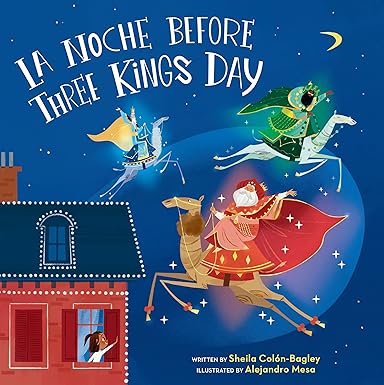
LA NOCHE BEFORE THREE KINGS DAY
La Noche Before Three Kings Day is a perfect holiday tale.
More info →TRACKING SHADOWS
When danger whispers in the dark, the shadows are the last place to hide…
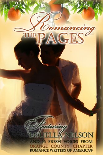
More info →ROMANCING THE PAGES
Celebrate all year long through Romancing the Pages
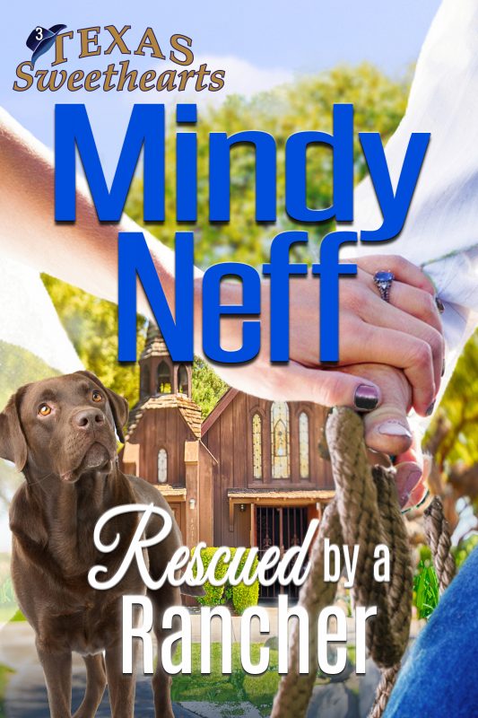
More info →RESCUED BY A RANCHER
What Happens When A Texas Sweetheart Is Born With A Silver Spoon? She Stirs Up Trouble In Hope Valley!
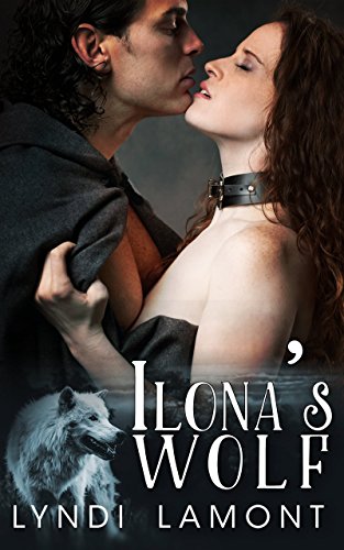
More info →ILONA’S WOLF
Imagine a world filled with magic, a tormented knight, a damsel in distress, an evil sorcerer...
More info →Newsletter
Contributing Authors
Search A Slice of Orange
Find a Column
Archives
Authors in the Bookstore
- A. E. Decker
- A. J. Scudiere
- A.J. Sidransky
- Abby Collette
- Alanna Lucus
- Albert Marrin
- Alice Duncan
- Alina K. Field
- Alison Green Myers
- Andi Lawrencovna
- Andrew C Raiford
- Angela Pryce
- Aviva Vaughn
- Barbara Ankrum
- Bethlehem Writers Group, LLC
- Carol L. Wright
- Celeste Barclay
- Christina Alexandra
- Christopher D. Ochs
- Claire Davon
- Claire Naden
- Courtnee Turner Hoyle
- Courtney Annicchiarico
- D. Lieber
- Daniel V. Meier Jr.
- Debra Dixon
- Debra H. Goldstein
- Debra Holland
- Dee Ann Palmer
- Denise M. Colby
- Diane Benefiel
- Diane Sismour
- Dianna Sinovic
- DT Krippene
- E.B. Dawson
- Emilie Dallaire
- Emily Brightwell
- Emily PW Murphy
- Fae Rowen
- Faith L. Justice
- Frances Amati
- Geralyn Corcillo
- Glynnis Campbell
- Greg Jolley
- H. O. Charles
- Jaclyn Roché
- Jacqueline Diamond
- Janet Lynn and Will Zeilinger
- Jaya Mehta
- Jeff Baird
- Jenna Barwin
- Jenne Kern
- Jennifer D. Bokal
- Jennifer Lyon
- Jerome W. McFadden
- Jill Piscitello
- Jina Bacarr
- Jo A. Hiestand
- Jodi Bogert
- Jolina Petersheim
- Jonathan Maberry
- Joy Allyson
- Judy Duarte
- Justin Murphy
- Justine Davis
- Kat Martin
- Kidd Wadsworth
- Kitty Bucholtz
- Kristy Tate
- Larry Deibert
- Larry Hamilton
- Laura Drake
- Laurie Stevens
- Leslie Knowles
- Li-Ying Lundquist
- Linda Carroll-Bradd
- Linda Lappin
- Linda McLaughlin
- Linda O. Johnston
- Lisa Preston
- Lolo Paige
- Loran Holt
- Lynette M. Burrows
- Lyssa Kay Adams
- Madeline Ash
- Margarita Engle
- Marguerite Quantaine
- Marianne H. Donley
- Mary Castillo
- Maureen Klovers
- Megan Haskell
- Melanie Waterbury
- Melisa Rivero
- Melissa Chambers
- Melodie Winawer
- Meriam Wilhelm
- Mikel J. Wilson
- Mindy Neff
- Monica McCabe
- Nancy Brashear
- Neetu Malik
- Nikki Prince
- Once Upon Anthologies
- Paula Gail Benson
- Penny Reid
- Peter Barbour
- Priscilla Oliveras
- R. H. Kohno
- Rachel Hailey
- Ralph Hieb
- Ramcy Diek
- Ransom Stephens
- Rebecca Forster
- Renae Wrich
- Roxy Matthews
- Ryder Hunte Clancy
- Sally Paradysz
- Sheila Colón-Bagley
- Simone de Muñoz
- Sophie Barnes
- Susan Kaye Quinn
- Susan Lynn Meyer
- Susan Squires
- T. D. Fox
- Tara C. Allred
- Tara Lain
- Tari Lynn Jewett
- Terri Osburn
- Tracy Reed
- Vera Jane Cook
- Vicki Crum
- Writing Something Romantic
Affiliate Links
A Slice of Orange is an affiliate with some of the booksellers listed on this website, including Barnes & Nobel, Books A Million, iBooks, Kobo, and Smashwords. This means A Slice of Orange may earn a small advertising fee from sales made through the links used on this website. There are reminders of these affiliate links on the pages for individual books.
