Breaking Things Down Into Threes
June 26, 2011 by Marianne H. Donley in category Archives tagged as Beth Daniels, Online Class, pantsers, plotters, PlottingWith Beth Daniels aka Beth Henderson, J.B. Dane
About the Class:
Plots require organization – even those written by Pantsers. Why? Because all storytelling requires a flow, a smooth transition from one scene to the next. Getting it doesn’t require an outline though. All it requires is a system. A system of breaking everything down into thirds.
Three is a magic number. It’s used in art, music, interior design, and in literature. After all, doesn’t every story have a Beginning, a Middle, and an End? Three things.
But we need to go further. Need to section the various elements of our storylines into smaller and smaller divisions of three. Many have already have done this in writing essays at school, or in a public speaking class. Opening either a essay or a speech by telling the audience
- here’s what has occurred before and what we need to change,
- here is how we can change it or why we should change it, and
- the problem is this because of this and that and we need to do this to correct it.
Storylines in fiction do exactly the same thing, they simply use characterization, action and reaction to move along. Scenes can be broken down into threes; chapters can; POVs can. And in thinking by threes to create each tale, each element of a tale, story flow results.
Participants should have a work in progress, but it can be in any state of development – thinking about, early chapters, middle, or heading toward the conclusion. Thinking by threes works at any level, including editing. It can also help identify things that aren’t really needed in the book, the sort of things editors delete.
This class is for writers at any point in their writing career from unpublished to midlist.
About the Instructor:
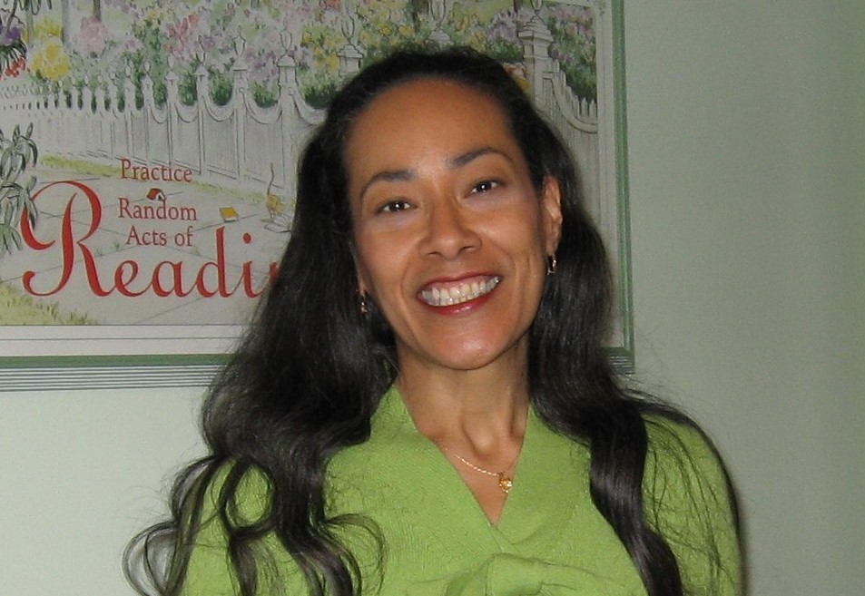
Beth Daniels currently writes as Beth Henderson and J.B. Dane, though she answered to Lisa Dane and Beth Cruise in the past as well. She has worked with editors at Berkley, Zebra, Leisure, Harlequin/Silhouette, and Simon and Schuster’s Aladdin Paperbacks, done e-books for a now defunct company (not her fault, she says), and began her writing life with hardcover books slated for library use with a publisher that got out of the romance business (again, not her fault). More recently she’s had a number of articles about writing picked up by e-zines, saw a short story published in a mystery and suspense magazine that turned up its toes the next year (really, really not her fault), and has a story in the MOTHER GOOSE IS DEAD anthology slated for publication by Dragon Moon Press in 2011.
For over a dozen years Beth taught college level composition, both in the classroom and online, and a credit course on Novel Writing. Twenty-six of Beth’s manuscripts have appeared in print or e-book format, and in 12 different languages in over 20 countries. At the moment she is working on various manuscripts, some fiction, some non-fiction but related to writing.
She is a member of Romance Writers of America, and an active member and volunteer with the Kiss of Death Online romantic suspense chapter, and a fixture at SavvyAuthors.com.
Website: www.RomanceAndMystery.com
Breaking Things Down into Threes with Beth Daniels aka Beth Henderson, J.B. Dane
Date: July 11 – August 6, 2011 this is a four week class
Cost: $20 for OCC members, $30 for non-OCC members
Enrollment Information: http://www.occrwa.org/onlineclassJuly11.html
Enrollment Deadline: July 9, 2011
If you have specific questions, email occrwaonlineclass@yahoo.com
*******************************
Upcoming classes:
August 15 – August 28, 2011
Writing from the Male Point of View to Create Stronger Heroes with Sascha Illyvich
September 12 – October 8, 2011
Show and Tell: An Interactive Workshop with Shannon Donnelly
Check out our full list of workshops. http://www.occrwa.org/onlineclasses.html
Want to be notified personally two weeks before each class? Be sure you’re
signed up for our Online Class Notices Yahoo Group! Sign up at the bottom of http://www.occrwa.org/onlineclasses.html or send a blank email to OCCRWAOnlineClassNotices-subscribe@yahoogroups.com
********** permission to forward **********
0 0 Read moreDrink Local – Thoughts on trends by Isabel Swift
June 24, 2011 by Isabel Swift in category From Isabel Swift tagged as Local, TrendsFinally, I can be trendy!
When I’m at a restaurant and the waiter arrives and asks…”Would you prefer sparkling or still mineral water?” I no longer have to be branded as a plebian, one of the unwashed, uncultured and/or possibly just cheap types, as I have in the past (responding with the low-brow…”Actually, tap water is fine, thank you.”)
Now I can say, “Thank you, but I prefer local water.”
I can even give them the hairy eyeball for suggesting any right thinking human would insist on importing their water, complete with non-bio-degradable plastic or costly glass not to mention the diesel/gas costs for lugging the tonnage from whatever pure-sounding, exotic, or just plain expensively packaged product to my table.
I mean really! When fresh, local water is available (free of charge, I might add) bubbling from a tap RIGHT THERE in the restaurant. Their own private and locally grown pipe-fed spring. It doesn’t get much more local than that!
And filled with locally grown minerals and other nutrients, each local water has its own individual and unique bouquet. That’s what local is all about, isn’t it?
(Add in as much of the rest of the pro-local verbiage as you choose).
Take my word for it, you are definitely on the moral high ground here.
Drink up!
2 0 Read moreWriting for Two Publishers
June 23, 2011 by Marianne H. Donley in category Archives tagged as Charlotte Carter, Guideposts Books, Love InspiredBig Sky Reunion, Love Inspired, available now
Big Sky Family, Love Inspired, 11/2011
Writer’s Block
June 22, 2011 by Marianne H. Donley in category Archives tagged as Bill Zeilinger, cartoons, writer's blockJuly Contest Deadlines
June 20, 2011 by Marianne H. Donley in category Archives tagged as ContestsUpdated and all sites tested…Compiled by Donna Caubarreaux….May be forwarded with credits.
EA = Electronic Format Available
EA/Non US = Electronic for Foreign Entries
EO = Electronic Only
MO = Members Only
U = Unpublished
P = Published
P/3 = Not published in three years
Pnr = Published, but not by RWA standards
PC = Not published in category selected
JULY CONTEST DEADLINES
Put Your Heart In A Book
New Jersey Romance Writers
Deadline received Midnight July 1, 2011
Synopsis and First Chapter not to exceed thirty pages.
Dixie Kane Memorial Contest
South Louisiana Chapter of RWA
Deadline: July 15, 2011
First five pages plus one page single-spaced synopsis.
Heartbeat Romance Writing Contest (U – P)
Heart of Louisiana
Deadline: Snail Mail or Email – July 15, 2011
Query letter and first five pages
Heart of the West Contest
Utah RWA Chapter
EO Deadline: July 15, 2011
First twenty pages.
Indiana Golden Opportunity Contest
Indiana RWA
Received by July 15, 2011 – EO
Beginning and synopsis not to exceed thirty-five pages.
AUGUST CONTEST DEADLINES
Four Seasons Contest
Windy City RWA Chapter
Deadline: August 1, 2011
Info not detailed on website
Golden Rose Contest (EO – U – P/3 – PNR)
Rose City Romance Writers
Deadline: August 1, 2011 – Midnight PST
Up to fifty pages max.
Where the Magic Begins Contest (EO – U – P/3)
Romance Writers Ink
Deadline: August 1, 2011
Entry consists of the first 25 pages of manuscript and a one-page single-spaced synopsis (unjudged).
Golden Pen Contest (EO)
Golden Network Chapter
Received by August 15, 2011
Entry shall include a synopsis (not to exceed ten pages) plus the first consecutive pages of the manuscript in one document, together totaling not more than fifty-five pages.
Laurel Wreath Contest (P)
Volusia County Romance Writers
Received no later than August 31, 2011
Copyright of 2010
Show Me the Spark!
Heartland Romance Writers
Deadline: August 31, 2011
Information is not on website as yet.
SEPTEMBER CONTEST DEADLINES
Reveal Your Inner Vixen
Maryland Romance Writers
Received by September 1, 2011
Up to 20 pages of any scene that showcases your use of sensual tension, plus an unjudged 1-page set-up (optional).
HANDY CONTEST LINKS
Check out Contests and Contest Winners on: http://contestdivas.blogspot.com/
Check out the Award Winning Romance Books on: http://awardwinningromances.blogspot.com/
Contest Alert-All the news on upcoming contests, plus Finalist & Winner listings, questions, etc. Sign up now! ContestAlert-subscribe@yahoogroups.com
Announcement only list: ContestDeadlines-subscribe@yahoogroups.com
For Published Authors: ContestAlertPublished-subscribe@yahoogroups.com
If you’re a Contest Judge, join: ContestsJudges-subscribe@yahoogroups.com
Donna Caubarreaux is a member of Coeur de Louisiane, Scriptscene Chapter, NOLA Stars, Heart of Louisiana, and EPIC. She received a RWA Service Award in 1997
0 0 Read moreAffiliate Links
A Slice of Orange is an affiliate with some of the booksellers listed on this website, including Barnes & Nobel, Books A Million, iBooks, Kobo, and Smashwords. This means A Slice of Orange may earn a small advertising fee from sales made through the links used on this website. There are reminders of these affiliate links on the pages for individual books.
Search A Slice of Orange
Find a Column
Archives
Featured Books
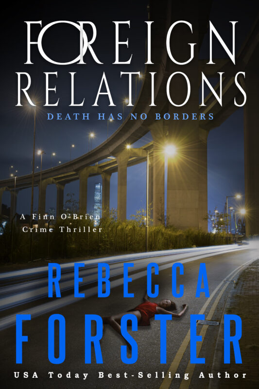
FOREIGN RELATIONS
A foreign woman is dead, two countries want her forgotten. Detective Finn O'Brien wants justice.
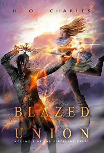
More info →BLAZED UNION
Fate has other plans for those with fire and fury in their hearts.
More info →Newsletter
Contributing Authors
Search A Slice of Orange
Find a Column
Archives
Authors in the Bookstore
- A. E. Decker
- A. J. Scudiere
- A.J. Sidransky
- Abby Collette
- Alanna Lucus
- Albert Marrin
- Alice Duncan
- Alina K. Field
- Alison Green Myers
- Andi Lawrencovna
- Andrew C Raiford
- Angela Pryce
- Aviva Vaughn
- Barbara Ankrum
- Bethlehem Writers Group, LLC
- Carol L. Wright
- Celeste Barclay
- Christina Alexandra
- Christopher D. Ochs
- Claire Davon
- Claire Naden
- Courtnee Turner Hoyle
- Courtney Annicchiarico
- D. Lieber
- Daniel V. Meier Jr.
- Debra Dixon
- Debra H. Goldstein
- Debra Holland
- Dee Ann Palmer
- Denise M. Colby
- Diane Benefiel
- Diane Sismour
- Dianna Sinovic
- DT Krippene
- E.B. Dawson
- Emilie Dallaire
- Emily Brightwell
- Emily PW Murphy
- Fae Rowen
- Faith L. Justice
- Frances Amati
- Geralyn Corcillo
- Glynnis Campbell
- Greg Jolley
- H. O. Charles
- Jaclyn Roché
- Jacqueline Diamond
- Janet Lynn and Will Zeilinger
- Jaya Mehta
- Jeff Baird
- Jenna Barwin
- Jenne Kern
- Jennifer D. Bokal
- Jennifer Lyon
- Jerome W. McFadden
- Jill Piscitello
- Jina Bacarr
- Jo A. Hiestand
- Jodi Bogert
- Jolina Petersheim
- Jonathan Maberry
- Joy Allyson
- Judy Duarte
- Justin Murphy
- Justine Davis
- Kat Martin
- Kidd Wadsworth
- Kitty Bucholtz
- Kristy Tate
- Larry Deibert
- Larry Hamilton
- Laura Drake
- Laurie Stevens
- Leslie Knowles
- Li-Ying Lundquist
- Linda Carroll-Bradd
- Linda Lappin
- Linda McLaughlin
- Linda O. Johnston
- Lisa Preston
- Lolo Paige
- Loran Holt
- Lynette M. Burrows
- Lyssa Kay Adams
- Madeline Ash
- Margarita Engle
- Marguerite Quantaine
- Marianne H. Donley
- Mary Castillo
- Maureen Klovers
- Megan Haskell
- Melanie Waterbury
- Melisa Rivero
- Melissa Chambers
- Melodie Winawer
- Meriam Wilhelm
- Mikel J. Wilson
- Mindy Neff
- Monica McCabe
- Nancy Brashear
- Neetu Malik
- Nikki Prince
- Once Upon Anthologies
- Paula Gail Benson
- Penny Reid
- Peter Barbour
- Priscilla Oliveras
- R. H. Kohno
- Rachel Hailey
- Ralph Hieb
- Ramcy Diek
- Ransom Stephens
- Rebecca Forster
- Renae Wrich
- Roxy Matthews
- Ryder Hunte Clancy
- Sally Paradysz
- Sheila Colón-Bagley
- Simone de Muñoz
- Sophie Barnes
- Susan Kaye Quinn
- Susan Lynn Meyer
- Susan Squires
- T. D. Fox
- Tara C. Allred
- Tara Lain
- Tari Lynn Jewett
- Terri Osburn
- Tracy Reed
- Vera Jane Cook
- Vicki Crum
- Writing Something Romantic
Affiliate Links
A Slice of Orange is an affiliate with some of the booksellers listed on this website, including Barnes & Nobel, Books A Million, iBooks, Kobo, and Smashwords. This means A Slice of Orange may earn a small advertising fee from sales made through the links used on this website. There are reminders of these affiliate links on the pages for individual books.
