By Member at Large Monica Stoner, w/a Mona Karel
Deep in the recesses of my overstuffed memory is a ditty that supposedly did the rounds at a SciFi Convention. To the tune of “She’ll be Comin’ ‘Round the Mountainâ€
“There’s a dragon on the cover of my book
There’s a dragon on the cover of my book
He is green and he is scale-y but he’s nowhere in my tale-y
There’s a dragon on the cover of my book.â€
In the process of research of this ditty, I came across several other stanzas, including a bimbo on the cover, and a castle on the cover (for a book set in Seattle) and slightly different wording. The ending I remember referred to having a “wrong†cover is still better than finding one’s book in a remainder pile. By the way, if you Google that first line you can have a lot of fun missing out on your NaNo count while doing research.
Mind you this was a long time ago, before even Rocket Books (remember those?) had been created. Authors had no say in their covers, and were occasionally seen to wince when presented with the scantily clad heroine and the buff hero in excruciatingly tight trousers, open shirt, blond hair flying in the wind–never mind that he’s written as a brunette and he’s French. They were told the publisher knew what sold books much better than any writer.
Fast forward to now, and look at the changes in the publishing world. Digital books, print on demand, self publishing, author input on covers. And what do we see on many books? Bare chests, flowing hair, large breasts–and that’s the male. Seems even when the option exists to have input on our covers, authors are opting for the beef cake.
Do these covers really sell more books, even when they’re only displayed on the computer screen because we read electronically? Is there really more market for headless bare chested men with impossibly large breasts and muscles where no one has ever seen muscles?
 I realize some books lend themselves to these covers, since they are written more erotically. But not all of them. A friend did a survey for the cover of her second space opera book, showing various covers, and the most popular was the one with a bare chested man, with planets and space ships in the background. So maybe those covers do serve a purpose.
I’m contemplating covers since Black Opal Books has offered to publish my second book. The working title is “Teach Me To Forget,†and it’s about a photographer and a writer. So should I have a well muscled nekkid chested guy on the cover, holding a camera? I feel fortunate with the cover on “My Killer My Love,†since it conveys the mystery man in the woods concept, but I wonder if I should have looked farther for a more revealing photo?
What do you think, as writers and readers? Would you be more likely to pick up a book by an unknown author if the cover could qualify for serious eye candy?
- Author Bio
- Recent Posts
- Books
-
January 23, 2021
That’s right, not a fairy tale, a Tale Faery. A genuine hetero, cis Tale Faery. We’re rare.
It started with dragonflies on a magic summer day in Gainesville Florida. One of those 100+ degree, 100+% humidity (seriously, a clear blue sky supersaturated with humidity, a state of dew), my five-year-old daughter and I rode our bikes around a swamp, and I discovered what faeries are.
-
February 3, 2017By Member at Large Monica Stoner, w/a Mona KarelDeep in the recesses of my overstuffed memory is a ditty that supposedly did the rounds at a SciFi Convention. To the tune of “She’ll be Comin’ ‘Round the Mountain†“There’s a dragon on the cover of my bookThere’s a dragon on the cover of my bookHe […]
-
August 17, 2016By Member at Large Monica Stoner, w/a Mona KarelDeep in the recesses of my overstuffed memory is a ditty that supposedly did the rounds at a SciFi Convention. To the tune of “She’ll be Comin’ ‘Round the Mountain†“There’s a dragon on the cover of my bookThere’s a dragon on the cover of my bookHe […]
-
March 8, 2016By Member at Large Monica Stoner, w/a Mona KarelDeep in the recesses of my overstuffed memory is a ditty that supposedly did the rounds at a SciFi Convention. To the tune of “She’ll be Comin’ ‘Round the Mountain†“There’s a dragon on the cover of my bookThere’s a dragon on the cover of my bookHe […]
-
February 26, 2016By Member at Large Monica Stoner, w/a Mona KarelDeep in the recesses of my overstuffed memory is a ditty that supposedly did the rounds at a SciFi Convention. To the tune of “She’ll be Comin’ ‘Round the Mountain†“There’s a dragon on the cover of my bookThere’s a dragon on the cover of my bookHe […]
AN ELEMENT OF MYSTERTY: SWEET, FUNNY, AND STRANGE TALES OF INTRIGUE
Series: A Sweet, Funny, and Strange Anthology, Book 7
Genres: Mystery, Short Story Anthology
Tags: 2022, Anthology, Sweet, Funny, and Strange Tales
Dare you read our latest Sweet, Funny, and Strange® Anthology?
More info →FUR, FEATHERS AND SCALES: Sweet, Funny, and Strange Animal Tales
Series: A Sweet, Funny, and Strange Anthology, Book 6
Genres: Animal Stories, Short Story Anthology
Tags: 2020, Anthology, On Sale, Sweet, Funny, and Strange Tales
So cuddle up with your favorite pet-real or imaginary. No matter. You’ll find just the right story to share.
More info →ONCE UPON A TIME: Sweet, Funny, and Strange Tales for All Ages
Series: A Sweet, Funny, and Strange Anthology, Book 4
Genres: Children’s Books, Children’s Literature, Short Story Anthology
Tags: 2016, Anthology, Sweet, Funny, and Strange Tales, The Short Story Award
Step through our castle doors into a world of imagination!
More info →LET IT SNOW
Series: Bethlehem Writers Roundtable Collection, Book 1
Genre: Short Story Anthology
Tags: Anthology, On Sale, The Short Story Award
Tales as different as snowflakes.
More info →ONCE AROUND THE SUN: Sweet, Funny, and Stranges Tales for All Seasons
Series: A Sweet, Funny, and Strange Anthology, Book 2
Genre: Short Story Anthology
Tags: Anthology, Sweet, Funny, and Strange Tales, The Short Story Award
Stories about winter, spring, summer and fall, and seasons of life, seasons of love, and even seasons of discovery.
More info →UNTETHERED: SWEET, FUNNY, AND STRANGE TALES OF THE PARANORMAL
Series: A Sweet, Funny, and Strange Anthology, Book 5
Genres: Paranormal, Short Story Anthology
Tags: 2018, Anthology, Sweet, Funny, and Strange Tales, The Short Story Award
Stoke the campfire and get ready for some chills and goosebumps when you open this paranormal addition to the award-winning Bethlehem Writers Group’s “Sweet, Funny, and Strange” anthologies.
More info →A READABLE FEAST: Sweet, Funny, and Strange Tales for Every Taste
Series: A Sweet, Funny, and Strange Anthology, Book 3
Genre: Short Story Anthology
Tags: Anthology, Sweet, Funny, and Strange Tales, The Short Story Award
Yearning for a tantalizing tale?
More info →TO L.A. WITH LOVE: A CHARITY ANTHOLOGY
Genres: Romance, Short Story Anthology, Short Story Collection
Tags: 2025, Anthology, Recommended Books, Romance
When wildfires destroyed two beloved Los Angeles public libraries in January 2025, the romance community answered with heart.
More info →

Related
Affiliate Links
A Slice of Orange is an affiliate with some of the booksellers listed on this website, including Barnes & Nobel, Books A Million, iBooks, Kobo, and Smashwords. This means A Slice of Orange may earn a small advertising fee from sales made through the links used on this website. There are reminders of these affiliate links on the pages for individual books.
Search A Slice of Orange
Find a Column
Archives
Featured Books
GIRL IN THE MIST
We all keep secrets, especially from the ones we love.
More info →INTENTIONAL CURSE
Before Dr. Eric King was with Kyla, he chased Olivia Bennett.
More info →Newsletter
Contributing Authors
Search A Slice of Orange
Find a Column
Archives
Authors in the Bookstore
- A. E. Decker
- A. J. Scudiere
- A.J. Sidransky
- Abby Collette
- Alanna Lucus
- Albert Marrin
- Alice Duncan
- Alina K. Field
- Alison Green Myers
- Andi Lawrencovna
- Andrew C Raiford
- Angela Pryce
- Aviva Vaughn
- Barbara Ankrum
- Bethlehem Writers Group, LLC
- Carol L. Wright
- Celeste Barclay
- Christina Alexandra
- Christopher D. Ochs
- Claire Davon
- Claire Naden
- Courtnee Turner Hoyle
- Courtney Annicchiarico
- D. Lieber
- Daniel V. Meier Jr.
- Debra Dixon
- Debra H. Goldstein
- Debra Holland
- Dee Ann Palmer
- Denise M. Colby
- Diane Benefiel
- Diane Sismour
- Dianna Sinovic
- DT Krippene
- E.B. Dawson
- Emilie Dallaire
- Emily Brightwell
- Emily PW Murphy
- Fae Rowen
- Faith L. Justice
- Frances Amati
- Geralyn Corcillo
- Glynnis Campbell
- Greg Jolley
- H. O. Charles
- Jaclyn Roché
- Jacqueline Diamond
- Janet Lynn and Will Zeilinger
- Jaya Mehta
- Jeff Baird
- Jenna Barwin
- Jenne Kern
- Jennifer D. Bokal
- Jennifer Lyon
- Jerome W. McFadden
- Jill Piscitello
- Jina Bacarr
- Jo A. Hiestand
- Jodi Bogert
- Jolina Petersheim
- Jonathan Maberry
- Joy Allyson
- Judy Duarte
- Justin Murphy
- Justine Davis
- Kat Martin
- Kidd Wadsworth
- Kitty Bucholtz
- Kristy Tate
- Larry Deibert
- Larry Hamilton
- Laura Drake
- Laurie Stevens
- Leslie Knowles
- Li-Ying Lundquist
- Linda Carroll-Bradd
- Linda Lappin
- Linda McLaughlin
- Linda O. Johnston
- Lisa Preston
- Lolo Paige
- Loran Holt
- Lynette M. Burrows
- Lyssa Kay Adams
- Madeline Ash
- Margarita Engle
- Marguerite Quantaine
- Marianne H. Donley
- Mary Castillo
- Maureen Klovers
- Megan Haskell
- Melanie Waterbury
- Melisa Rivero
- Melissa Chambers
- Melodie Winawer
- Meriam Wilhelm
- Mikel J. Wilson
- Mindy Neff
- Monica McCabe
- Nancy Brashear
- Neetu Malik
- Nikki Prince
- Once Upon Anthologies
- Paula Gail Benson
- Penny Reid
- Peter Barbour
- Priscilla Oliveras
- R. H. Kohno
- Rachel Hailey
- Ralph Hieb
- Ramcy Diek
- Ransom Stephens
- Rebecca Forster
- Renae Wrich
- Roxy Matthews
- Ryder Hunte Clancy
- Sally Paradysz
- Sheila Colón-Bagley
- Simone de Muñoz
- Sophie Barnes
- Susan Kaye Quinn
- Susan Lynn Meyer
- Susan Squires
- T. D. Fox
- Tara C. Allred
- Tara Lain
- Tari Lynn Jewett
- Terri Osburn
- Tracy Reed
- Vera Jane Cook
- Vicki Crum
- Writing Something Romantic
Affiliate Links
A Slice of Orange is an affiliate with some of the booksellers listed on this website, including Barnes & Nobel, Books A Million, iBooks, Kobo, and Smashwords. This means A Slice of Orange may earn a small advertising fee from sales made through the links used on this website. There are reminders of these affiliate links on the pages for individual books.


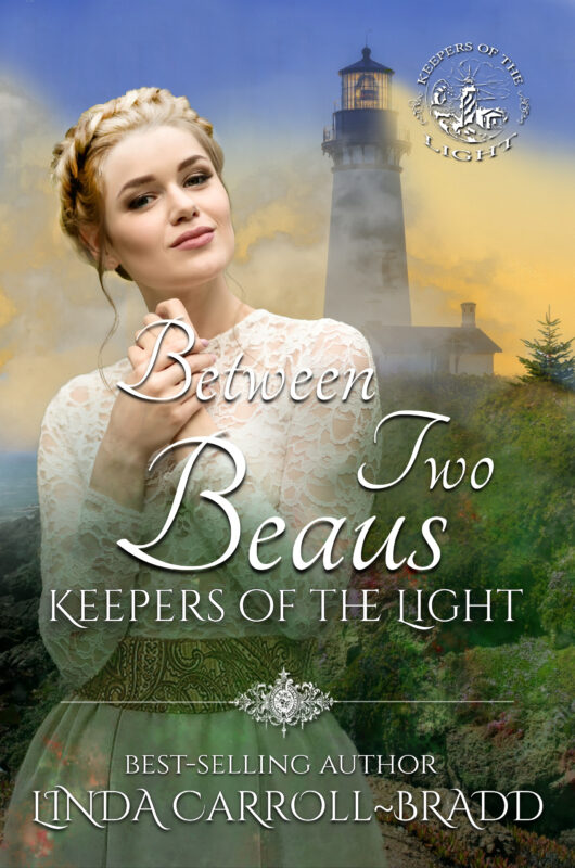





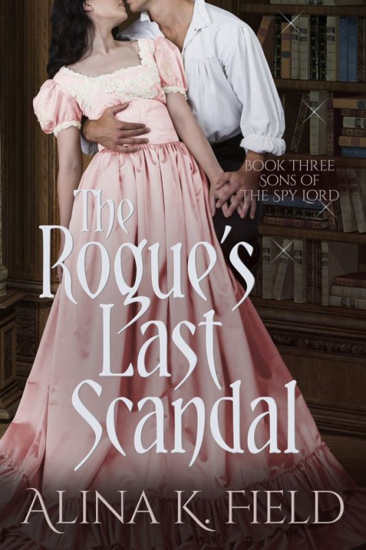









Ive been VERY lucky with all my covers, but I have friends whose Covers have nothing to do with their story and Im sure its affected their sales. I have to admit its the Cover that will make me pick up a book first.
Great post!
Hugs, Kari Thomas, http://www.authorkari.com
Though it's true the image on the cover is important, it's more true that the quality of the overall cover can impact sales. If it looks amateurish, readers will believe what's inside is just as bad. Whether the image is beefcake or as simple as a cottage in the woods, it must be handled professionally. I've been a professional graphic designer for over 30 years, so I have some experience with this.
There's a blog called Cover Art Review that lets visitors critique book covers that authors and artists have offered for feedback. See what some people are saying. The link is: http://coverartreview.blogspot.com
As an aside regarding the cover example someone gave a link to that shows the cover of a book about a photographer, this is a very busy cover. I caution against a crowded montage style of cover art. The composition might have too much going on and the title font fights with the image.
Mona, book cover and title play an important part of my decision to pick a new author's book. It doesn't necessarily mean a bare-chested guy. But a boring blah cover would definitely not get picked by me unless I've read the author before and loved their work. The decision to buy would be made after reading the blurb or the first line. If I already like the author, I don't even need the blurb. Like when I buy Olivia Gates, all I need to know is that she wrote it.
My experience is that a bad cover can hurt sales, but a good cover is, at best, neutral or maybe a little bit helpful. If you can control or influence your cover art, you have a better chance of not getting a bad cover, but this is easier with small press and indies than conglomerate presses.
I smiled as I read your post. Walk into any bookstore and peruse the romance section. Eighty percent of the covers have a naked chest on them. Different colors of print or background, put same air-brushed chest. As if the readers are too dumb to chose a book based on an intelligent, thought provoking cover. IMHO, it's overkill. For my covers, I explicitly say, no bare chests. Thank goodness I'm with a small publisher who listens.
for me the color of the book and the look what stand out and then
it will stand out in the store i have walk in to the book store and
bought book because of the cover
i do ask the autohor for cover or \book marks of the book i collect them and then i can in joy them
Here is a link to a friends cover about her female photographer:
http://sonjafoust.com/books/shooting-stars/
I love the covers and the camera fits. Unless it's an erotic story. I don't really want manly muscle on the cover. There comes a point where there is too much sexual promotion.